A very silly project.
Is it a joke? Or is it art? Is it something else?
In the history of silly things that are also art, there are a lot of works to consider. Is Monty Python and the Holy Grail art? Is Dr. Strangelove art? Maybe.
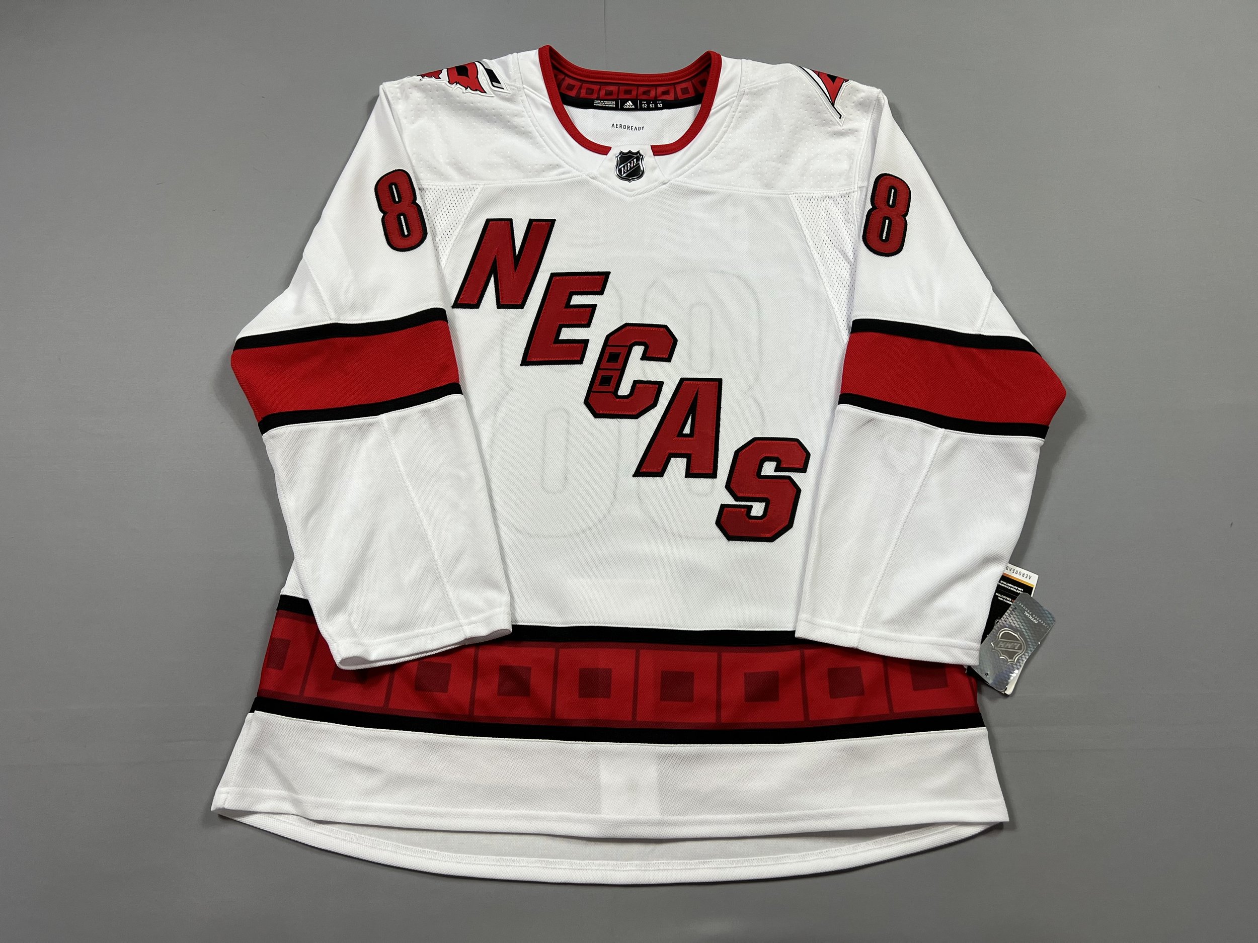
Is rearranging the letters of the Hurricanes Away jersey to spell a players name, art? Let’s dig into it.
Some Context
Martin Nečas was drafted 12th overall in the 2017 draft by the Canes, and for the first two years, he stayed down in the minors for the most part. In 2019, he joined the Canes a full-time roster player and has been ever since. He’s also been the source of some truly thirst-filled posts, notably the “Patiently waiting” post.
Additionally in 2019, the Canes debuted a new away jersey, replacing their very boring original Adidas away jersey with a somewhat controversial nickname wordmark design, featuring CANES written diagonally across the front.
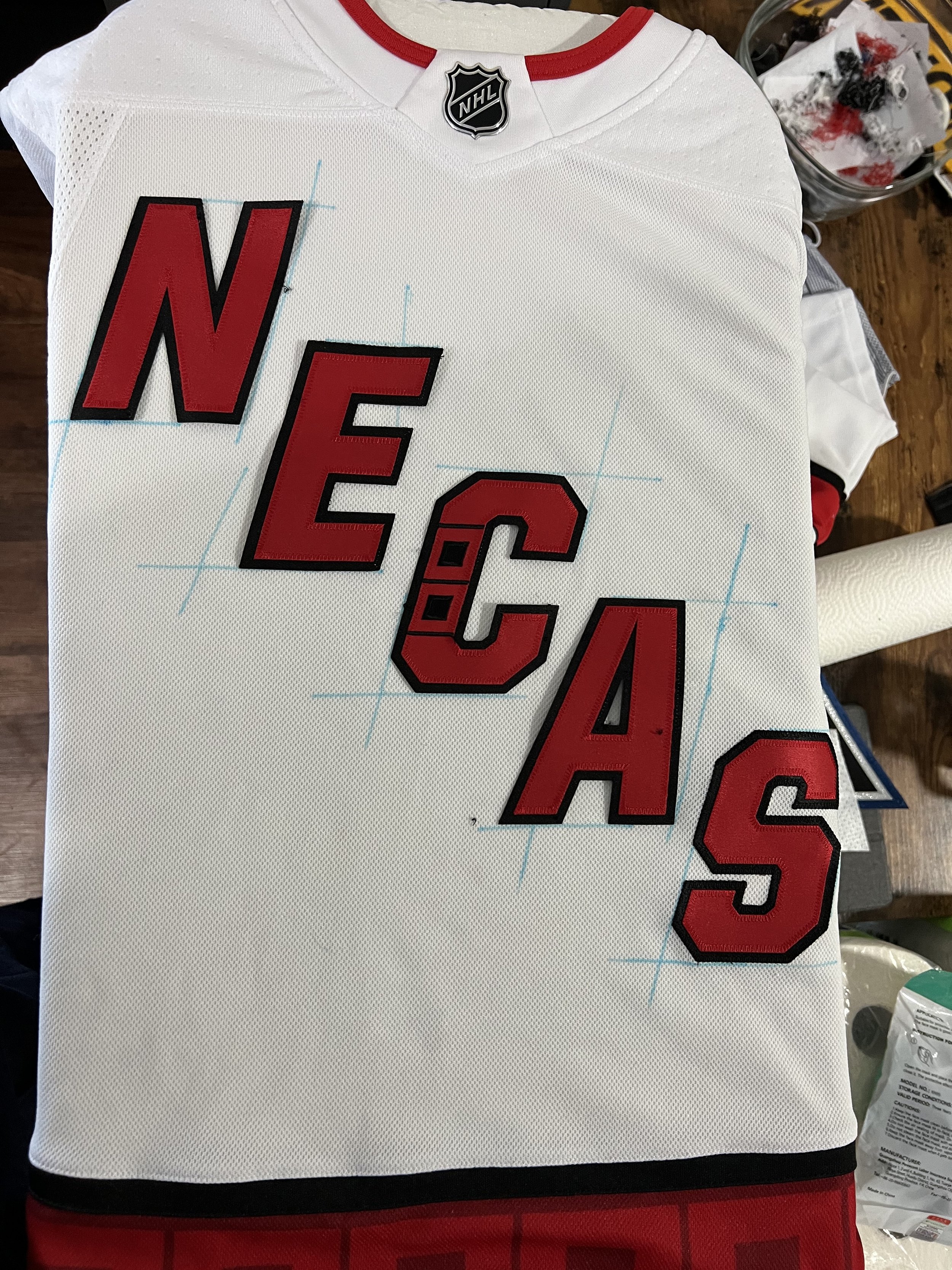
If you’re not seeing where I’m going with this, let me clue you in. CANES and NECAS are anagrams of each other, and once I saw the new jersey I knew at once what needed to be done.
I needed to create a monster. The NECAS away jersey. Originally this was a joke - who in their right mind would pay a company to disassemble a jersey, only to put it back together for a gag jersey? I reached out to a few companies, who gave me responses ranging from “no way” to “it’ll be $130+ in labor” - neither of which were great. Well, it just so happened that earlier this year I taught myself how to work on jerseys and stitch my own kits, which removed the largest barrier here.
We could begin making a most blursed jersey.
Sourcing materials
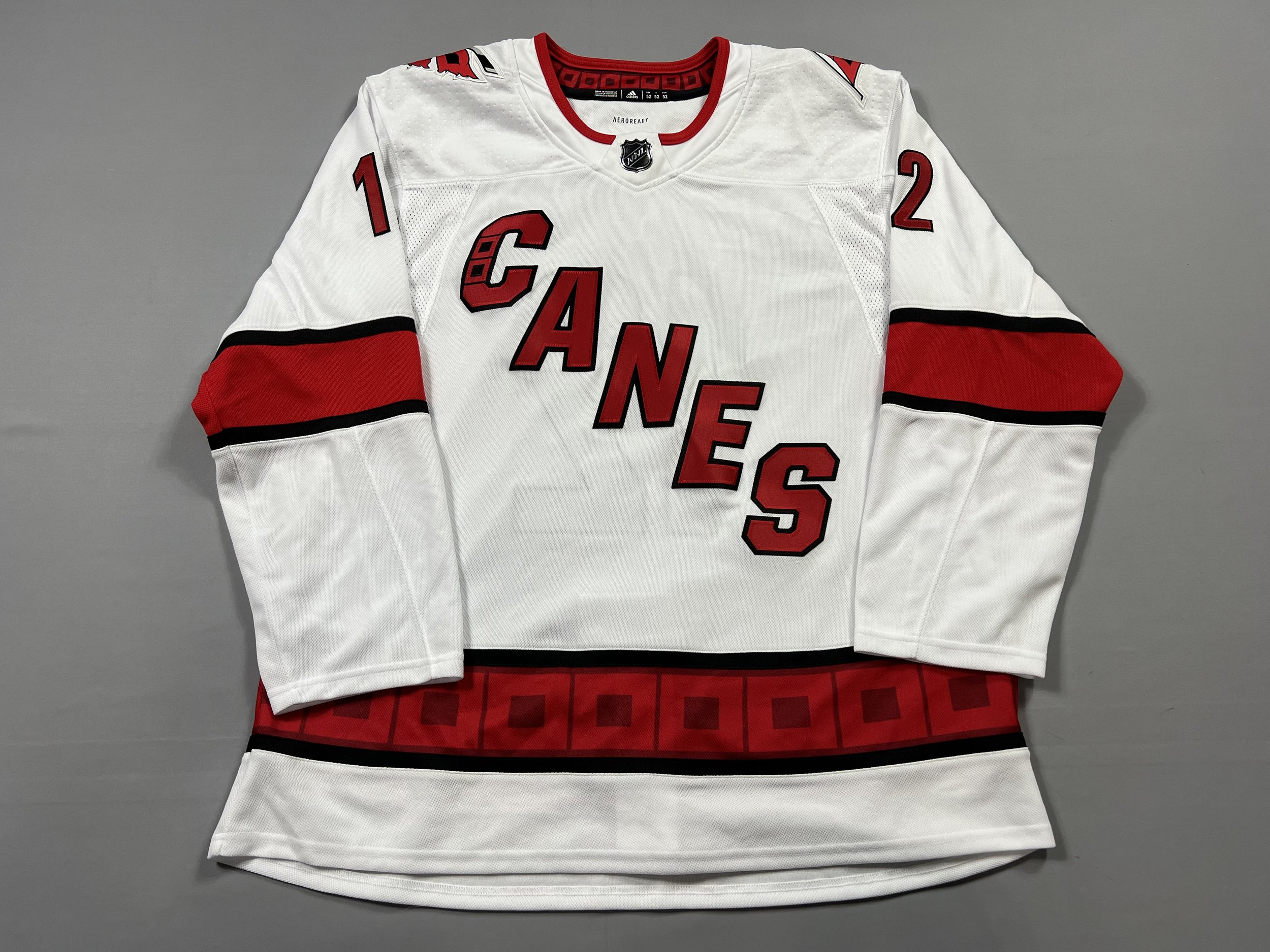
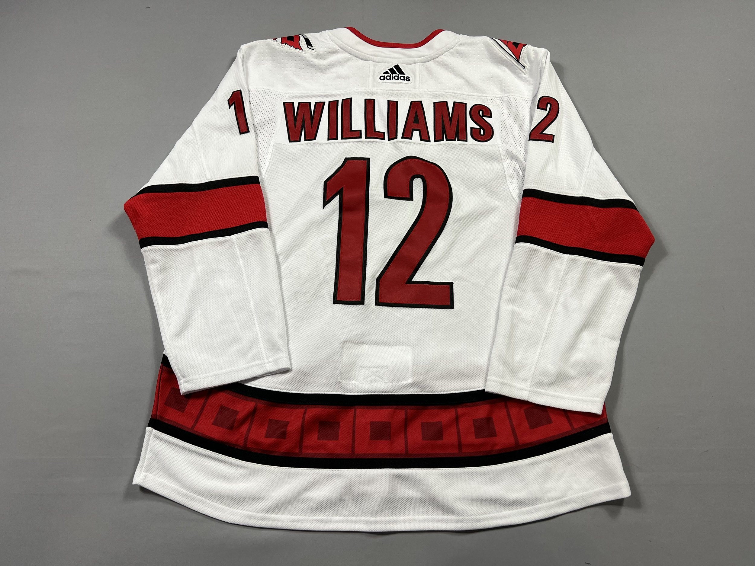
First things first - I needed to source a new Canes away jersey. I already had one done up as Svechnikov, so I didn’t want to sacrifice that. I also didn’t want to spend $130+ on a brand new one for a very silly concept. In early 2022, a seller put up a few oddly-kitted jerseys, including a new away customized with Williams/12. I’m not here to judge anyone on their customizations choices, but it would have to be stripped regardless. For $45, I wasn’t complaining though, not for a size 52.
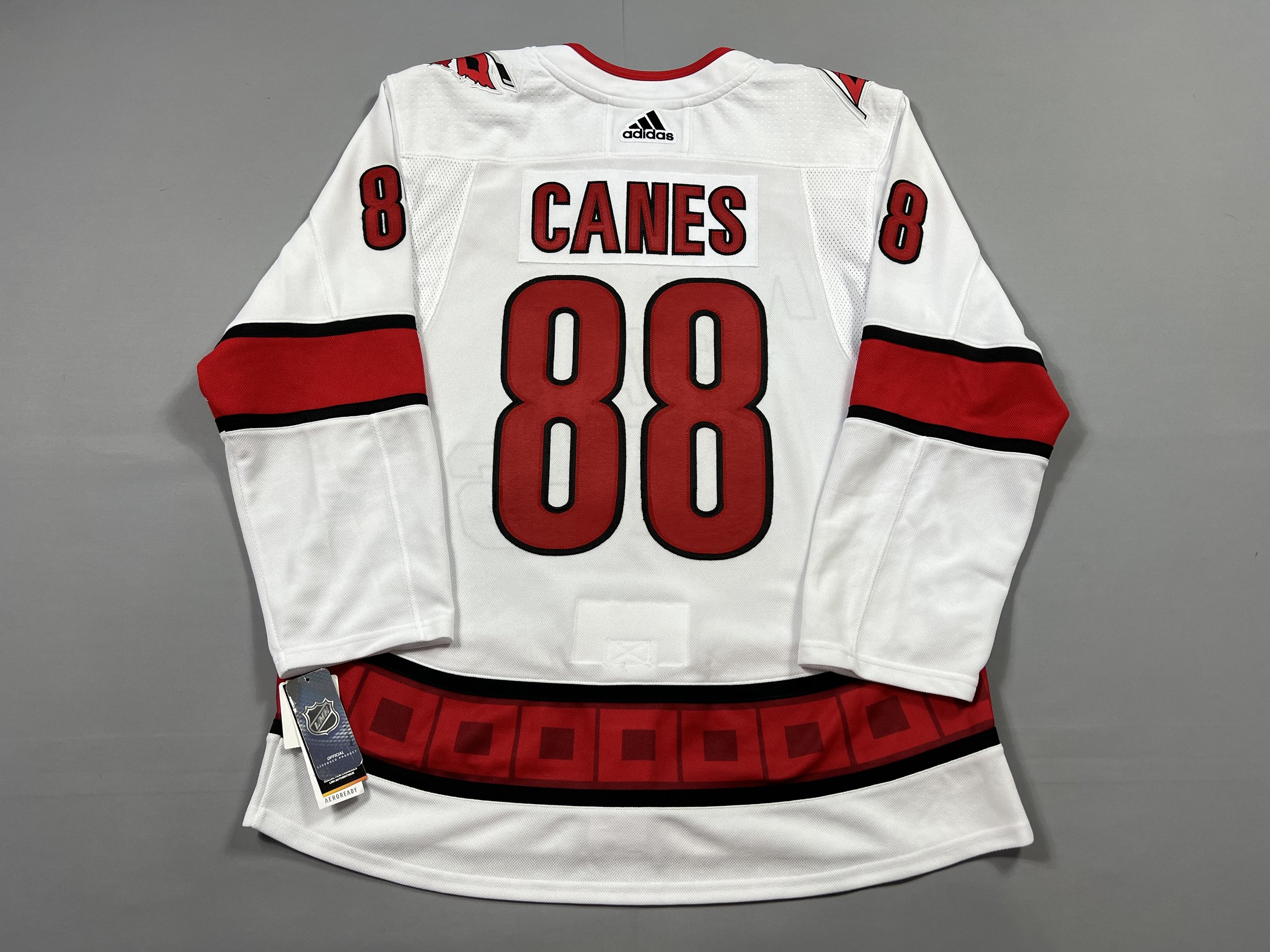
Once that was stripped, I then debated on how I wanted to handle the back of the jersey. Did I want NECAS on both the front and back, or should I continue with the anagram theme and make a CANES/88 jersey? To be determined.
Assembly
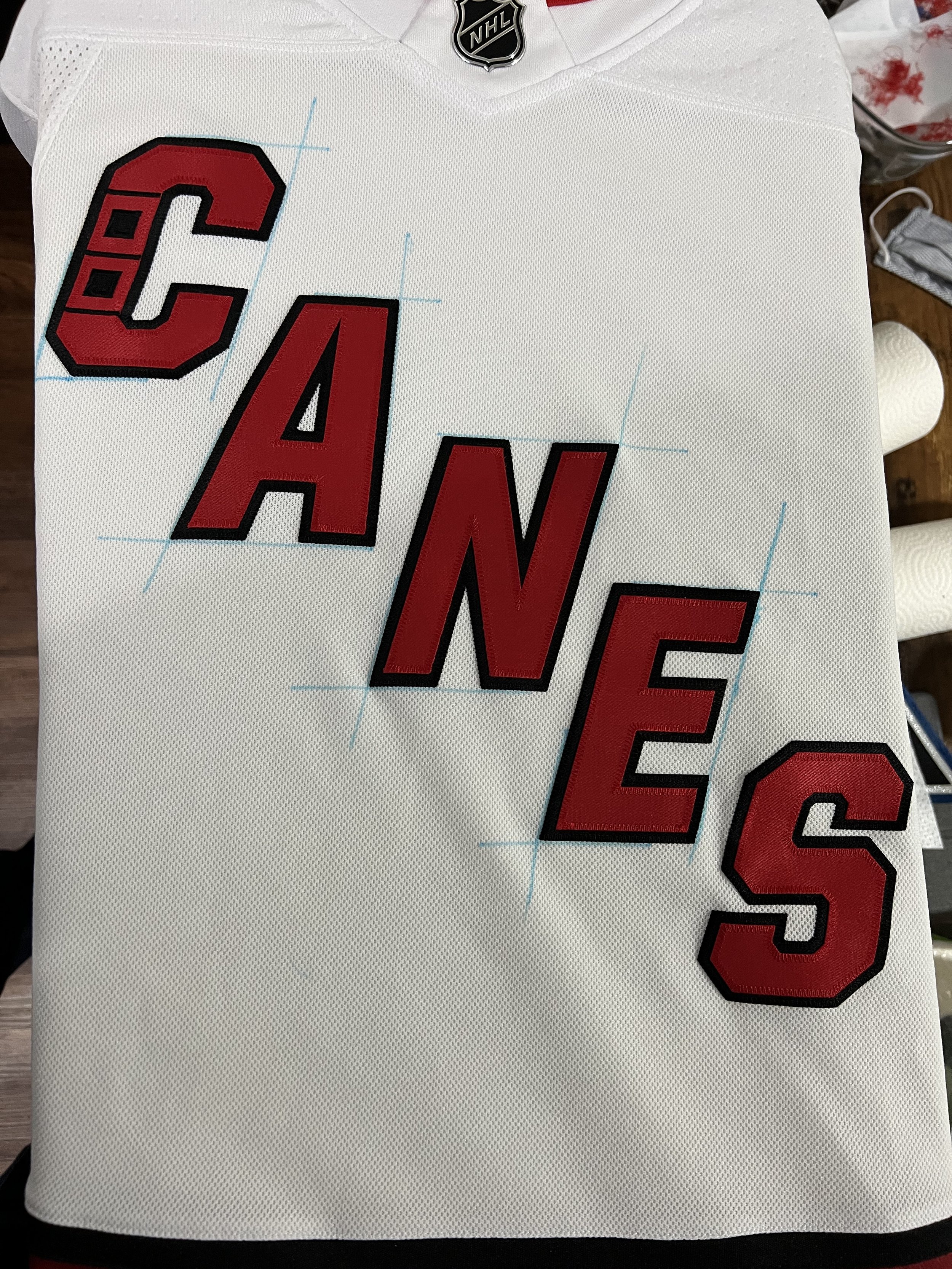
First thing I did was make outlines of the letters on the crest using some washable marker that I’ve mentioned before. It washes right out, so I wasn’t worried. Interestingly, the letters in the logo are not aligned in a straight line on the front - the A is way out of whack and once you see it, you’ll never un-see it. The “S” wasn’t moving, so I left it alone.
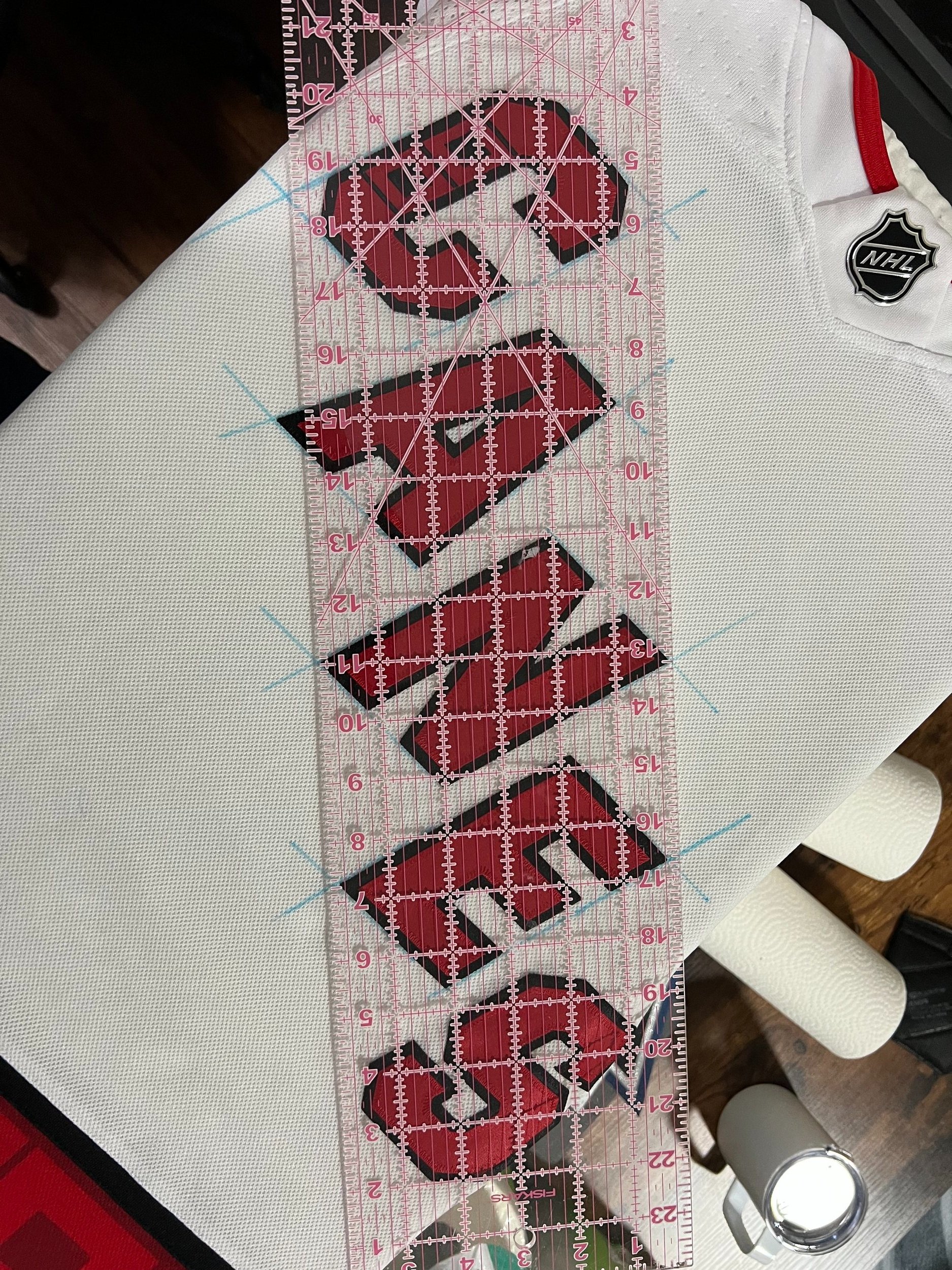
Once removed, I sprayed down the back of the letters with some temporary adhesive (Odif 505) and lined them back up using the guide corners that were created before. Once the crest was reattached, I ordered a kit. I didn’t want to wait the 6-9 months that the Hurricanes customizer normally takes, so using my newfound skills, I took matters into my own hands and went through Customize Sports.
Final Assembly
The kit arrived a few weeks before the writing of this post, and I added it to my queue. Once I was sufficiently caught up with other jerseys, I decided to have some fun and put together this cursed abomination of a jersey.
Without further ado, I present… the NECAS away jersey. It is cursed? Blessed? Art? Shitpost? Who knows. Maybe its existence will jolt him out of his slump.
All I know is that this is quite possibly the dumbest jersey-related thing I’ve ever done and I make no apologies for it.