
A rebrand update
Alright listen. I know I left the previous post on a cliffhanger, and I’ve obviously made changes since then. So let’s talk about that.
Background
I wrote up in a previous blog that I wasn’t satisfied with a simple roundel-style logo. Yea, it’s simple and it works, but it’s hard to make a roundel interesting.
I also wasn’t thrilled with the font. It was close to what I wanted for sure, but it just wasn’t scratching that itch.
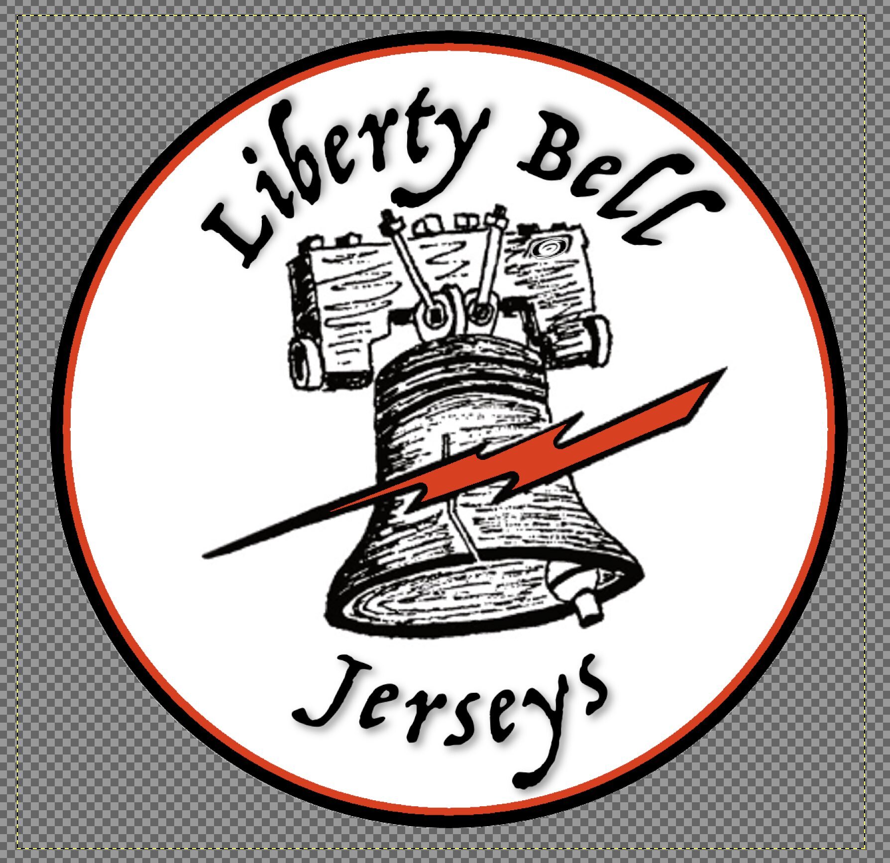
Overall, it just felt too basic for what I wanted to accomplish. One of my core values is collaboration, so I decided to lean on someone who I thought had really excellent branding.
TJF Collab
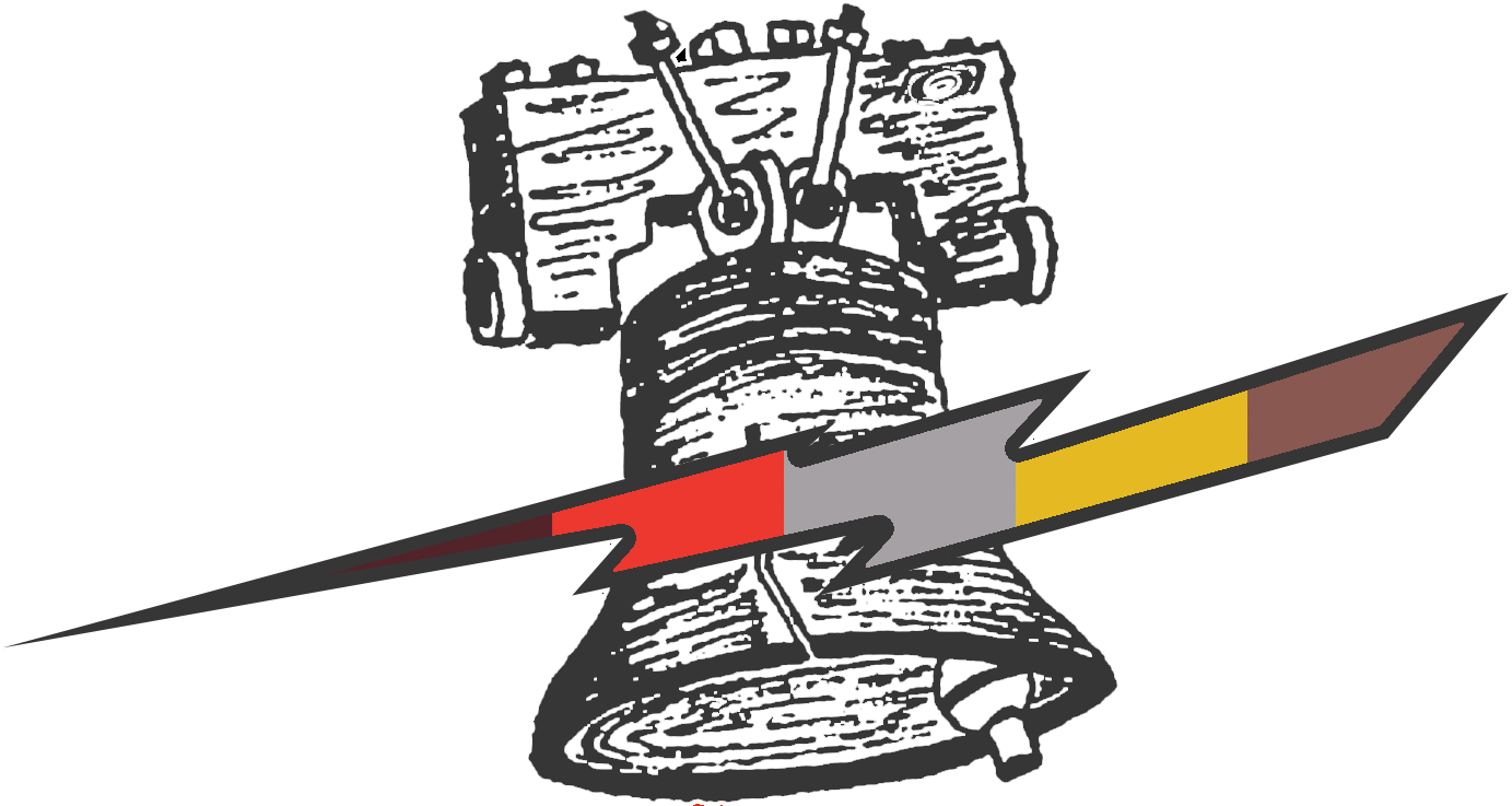
One of the best, and simple, brandings I had seen was the (now retired) TJF Twitter. The design was clean and simple, but still easily articulated what he did.


The logo was also flexible - he had two variants. One being the full “The Jersey Finder” and one being a stylized “TJF”
In my heart of hearts, I had always loved it and was quite frankly a little jealous of how damn good it was. So what to do other than lean on what I know - collaboration. Let’s ask the man how he came up with it.
TJF was totally open to helping me out. He gave me some really great feedback on the logo, and pointed me towards his guru - STB Visuals. They had worked together in a very tight 48-hour timeframe to come up with a great, simple logo to quickly articulate what he did. A few rough drafts later, and the TJF brand was born. I wanted the same thing - clean, simple, and straightforward.
STB Visuals
So I’m not good at graphic design. It’s just not my strong suit. But you know who is? STB Visuals. I looked through his twitter at some of the work he’d done, and I was digging it - so I reached out.
I won’t lie, I was really nervous about reaching out to a total stranger to help with my branding. I shot off that first “hey can you help” message and waited anxiously.
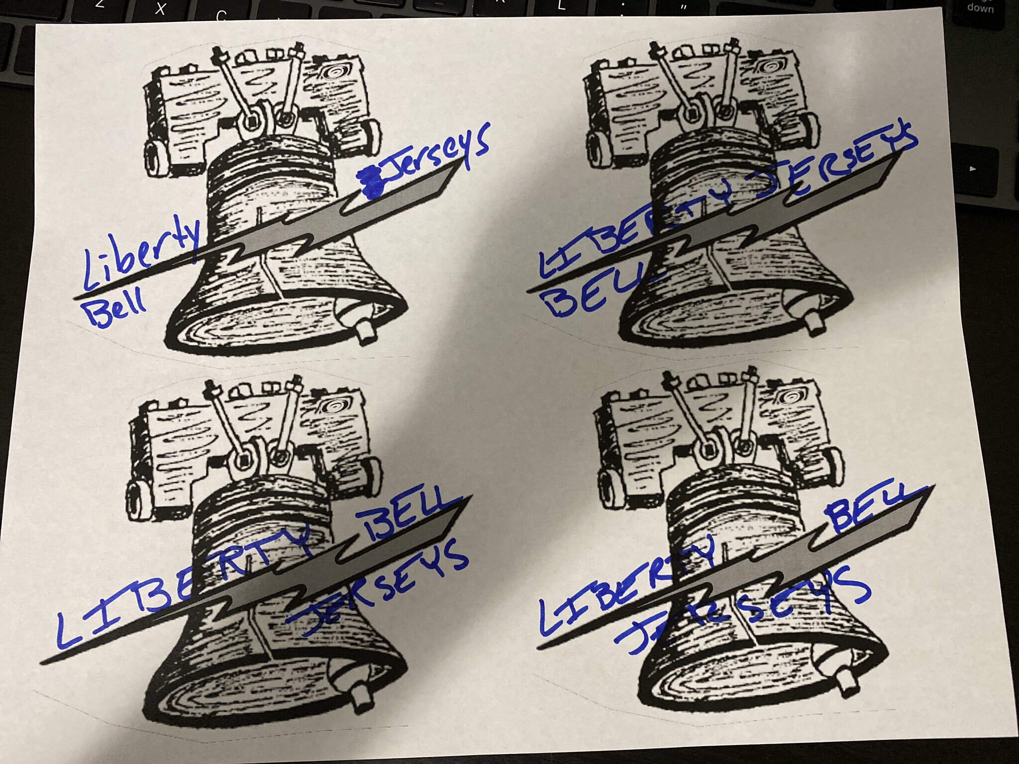
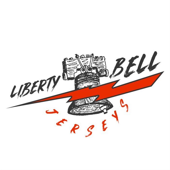
Tyler was super helpful and loved the idea and totally ran with it! We went through a few drafts and iterations of the logo, including some different font choices and stylization:
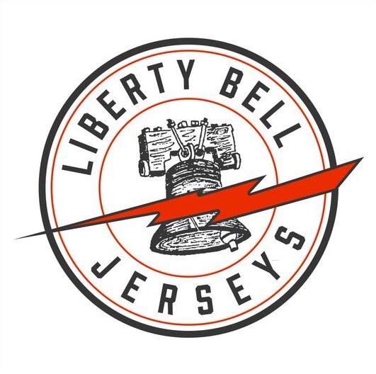
Final Design
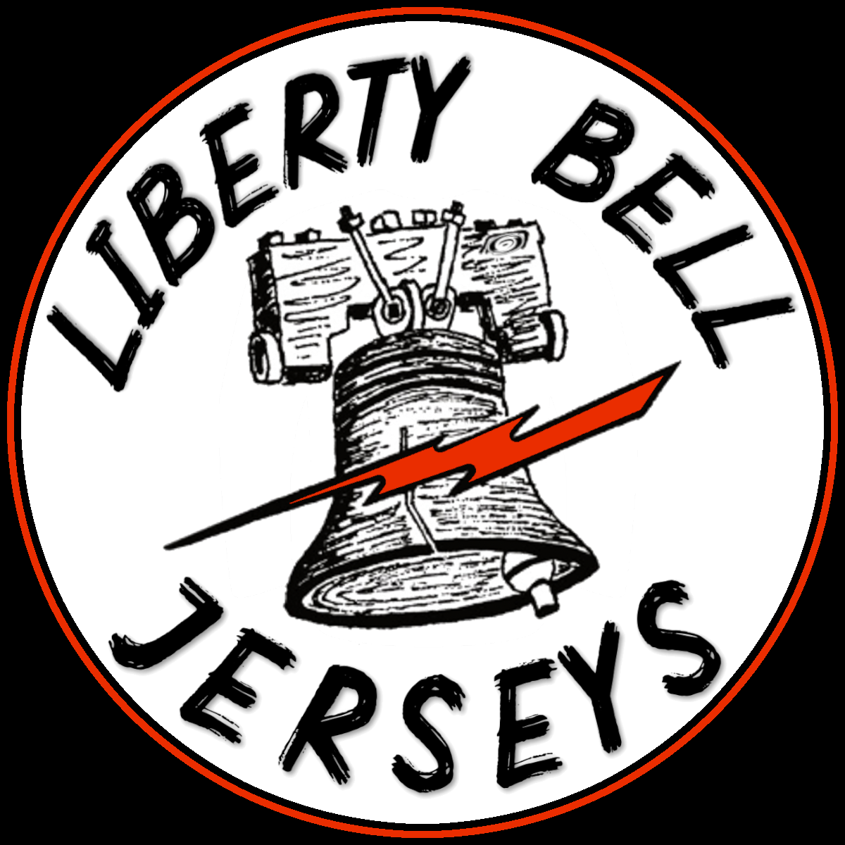
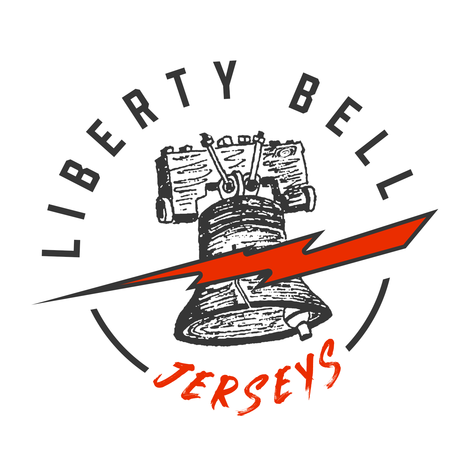
After a good amount of tweaking, we arrived at a final design. I gotta say, I love it. Tyler exaggerated the bolt, added some bars to help with the kerning on the bottom of the logo, and went with a mix of Prohibition and Pure Heart fonts.
What resulted of this was (in my opinion) an extremely clean and unique logo. It’s so easily identified and the orange just absolutely pops.
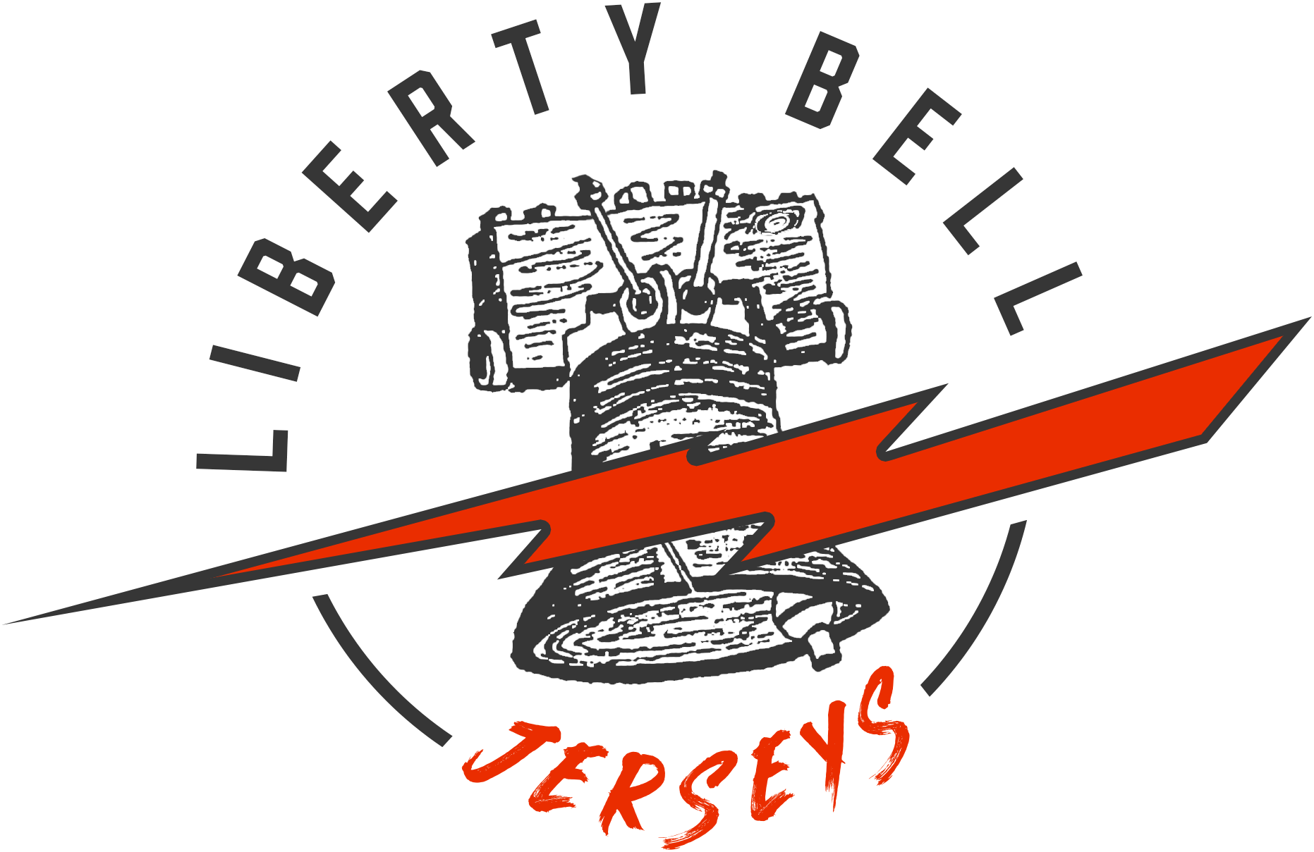
I tweaked a few things after - like making a transparent version, and shrinking the bolt slightly so it fit better on social media profile picture frames.
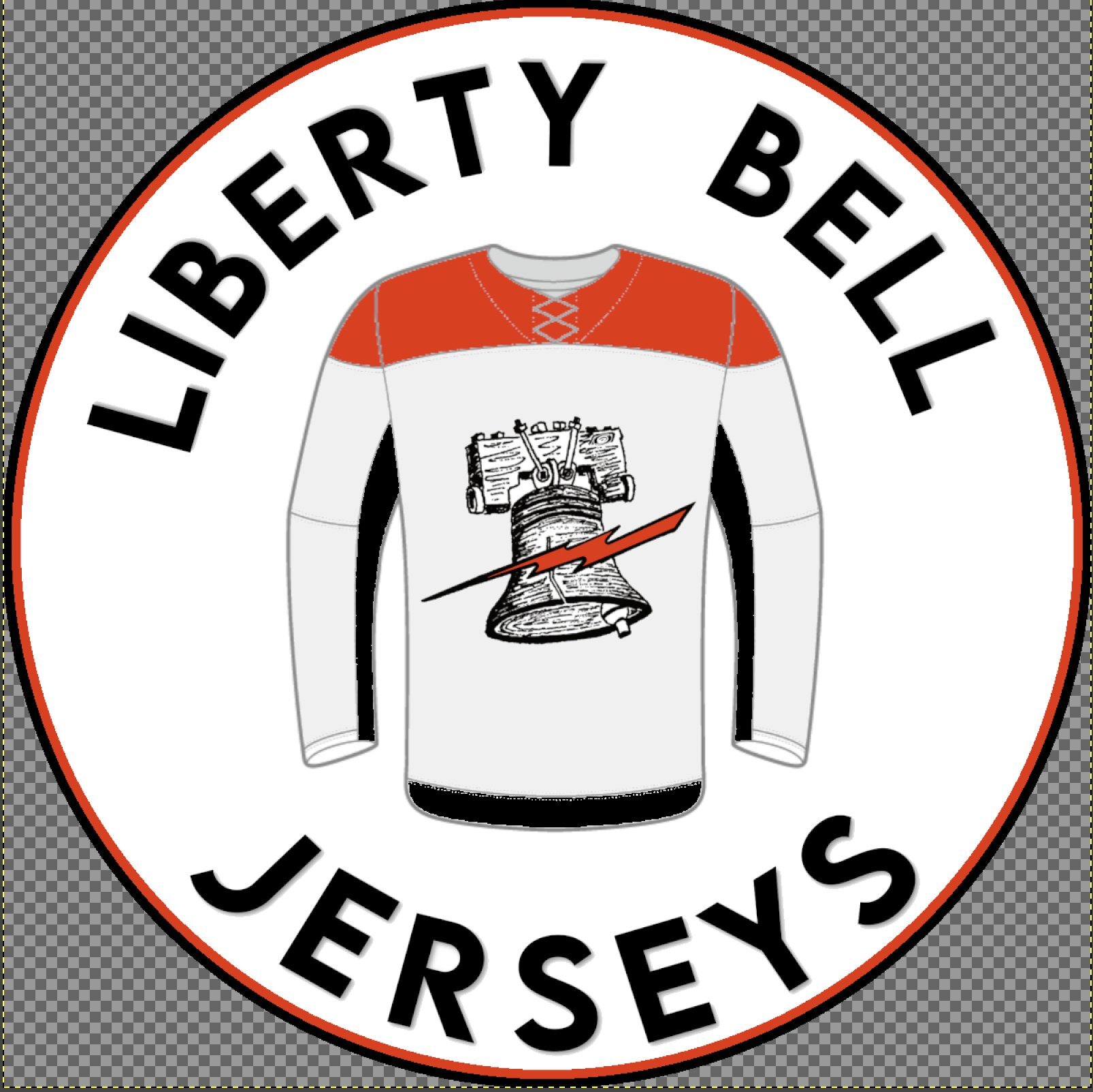
I loved it so much that I started putting it on stuff. Stickers, magnets - even shipping bags! All jerseys now come in a Liberty Bell Jerseys mailer (inside a box), with some sort of LBJ bonus.
It warms my heart to see the logo. I feel like I’ve done my grandfather proud in reinvigorating his original design from the 1950’s to be something so modern and so clean.
The Future
So, what does the future hold for Liberty Bell Jerseys?
One of the things that’s really cool about the logo is that it is flexible. I plan on making a Pride-based logo, as well as seeing about borrowing the color scheme from Hockey Diversity Alliance. I think both would lend themselves well to replacing the orange in the logo. Proceeds from both will go towards The Trevor Project and the HDA, respectively.
For LBJ itself - I’ve been doing a lot of repair and restoration projects for people and have been loving it. It brings me absolute joy to see a jersey that was once thought to be trashed brought back to life and see another day. Whether that be something as small as stain and sharpie removal or something as big as a full kit strip, I’m loving helping people get to their jersey goals.
Matt