A Giant Mail Day
I don’t post a lot of mail days these days, as I try to only post stuff that’s really interesting!
Over the last two days, I had nine jerseys come back from Exclusive Pro Sports (EPS) and Philly Xpress, so let’s talk about that!
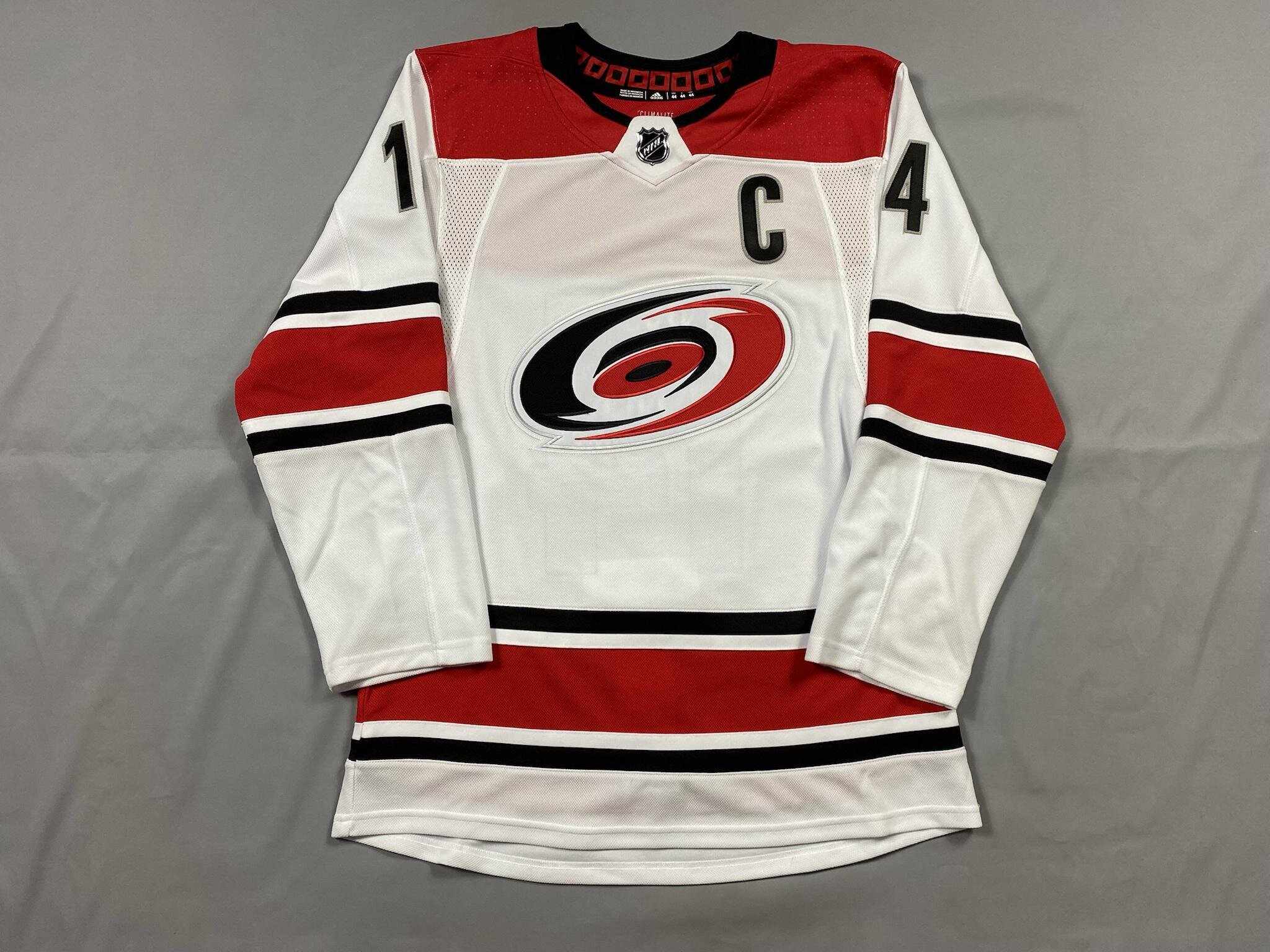
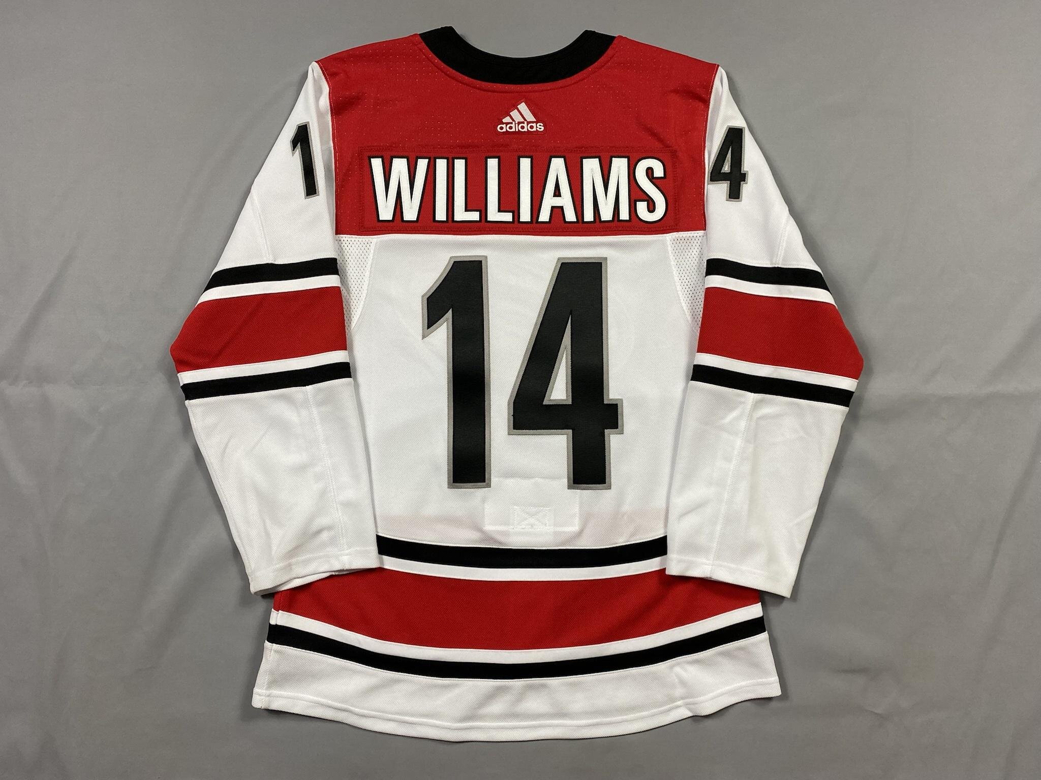
My wife isn’t a huge fan of wearing blanks. She wants it all the way - so I had to figure out who to put on this 2017-19 Canes Away jersey.
One of the last great moments in this jersey was the 2OT Game 7 winner against Washington. We weren’t sure if Brock McGinn would stick around, and Williams is an absolute gem of a human so we went with that!
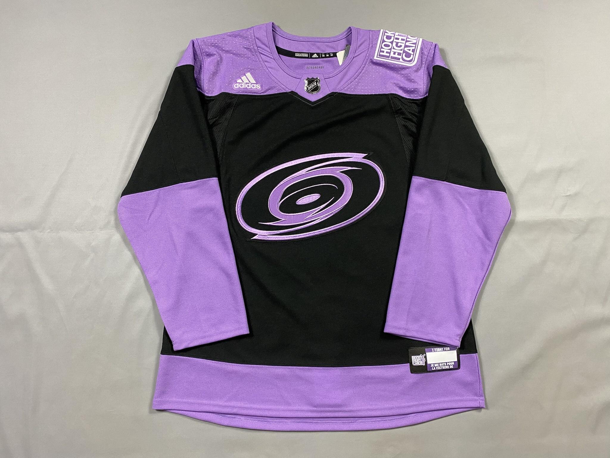
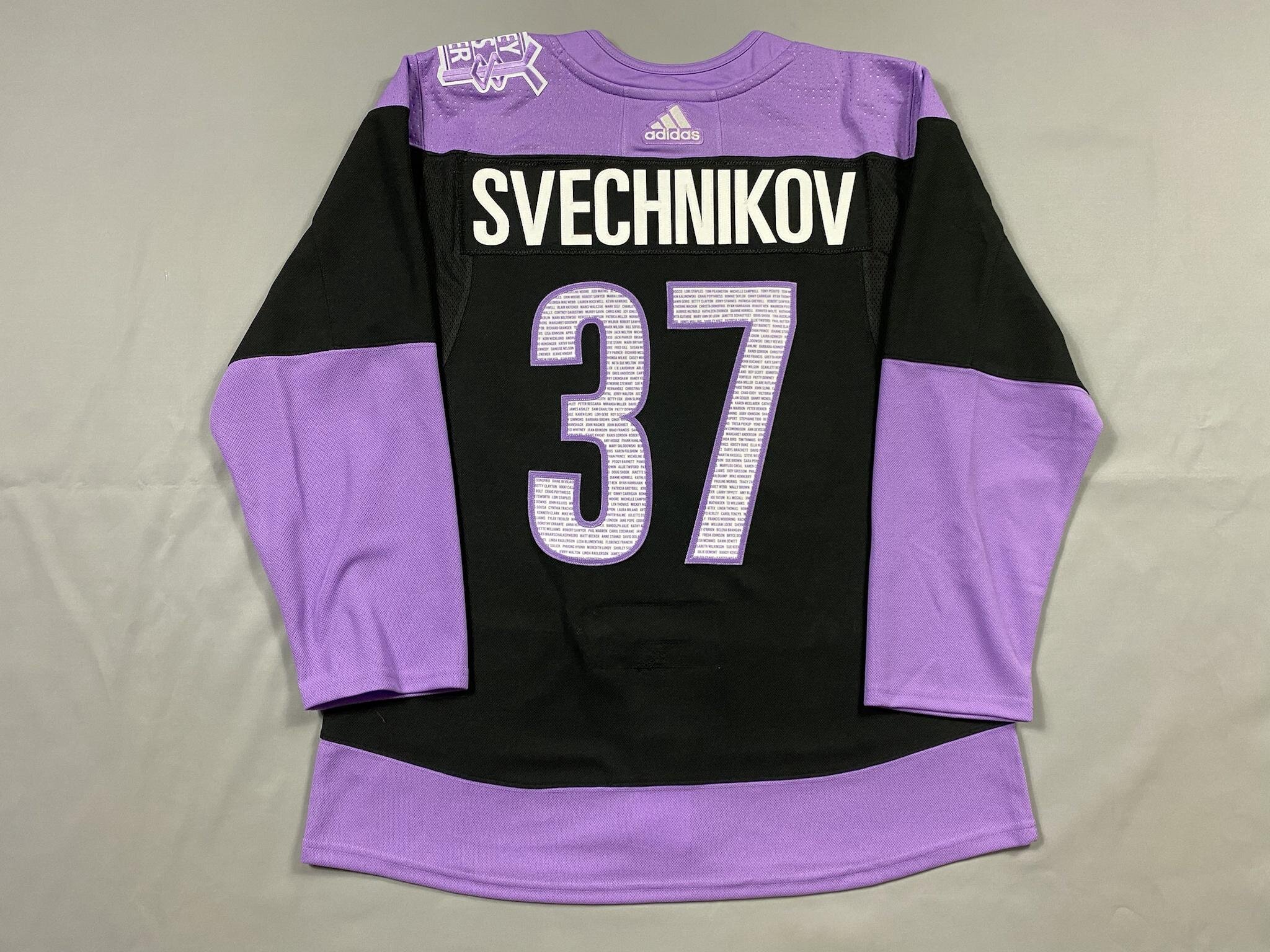
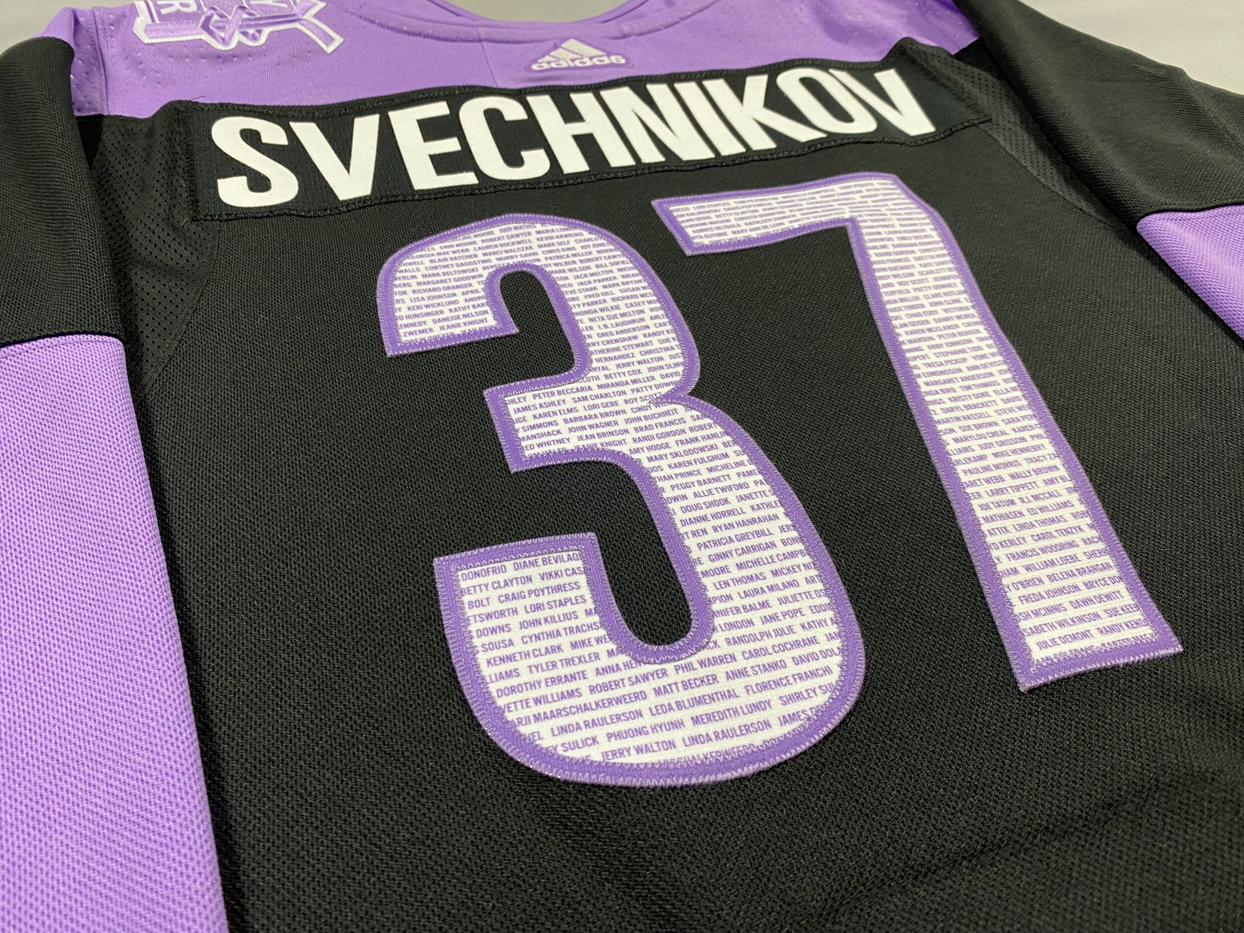
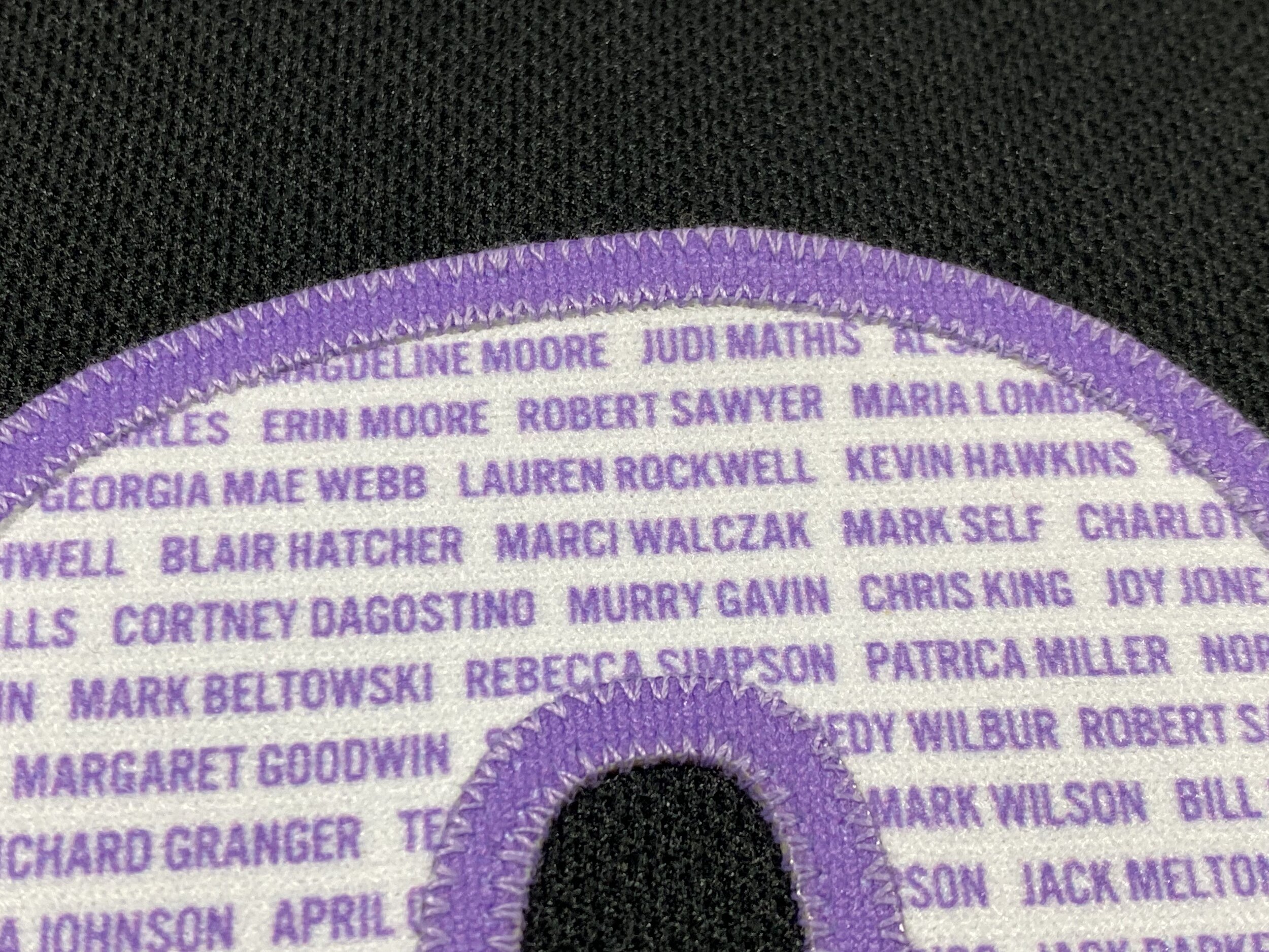
Last year, for Hockey Fights Cancer, the Hurricanes gathered a list of people in the STH community that were affected by cancer. One of my good family friend’s father passed due to it, and they wanted to get a jersey with his name on it. Originally, they bid on Martinook’s jersey but tapped out when it cleared $2.5k. They picked up a blank from The Eye and EPS was amazing in making sure their father’s name was on it.
I loved it so much, I got one for myself.
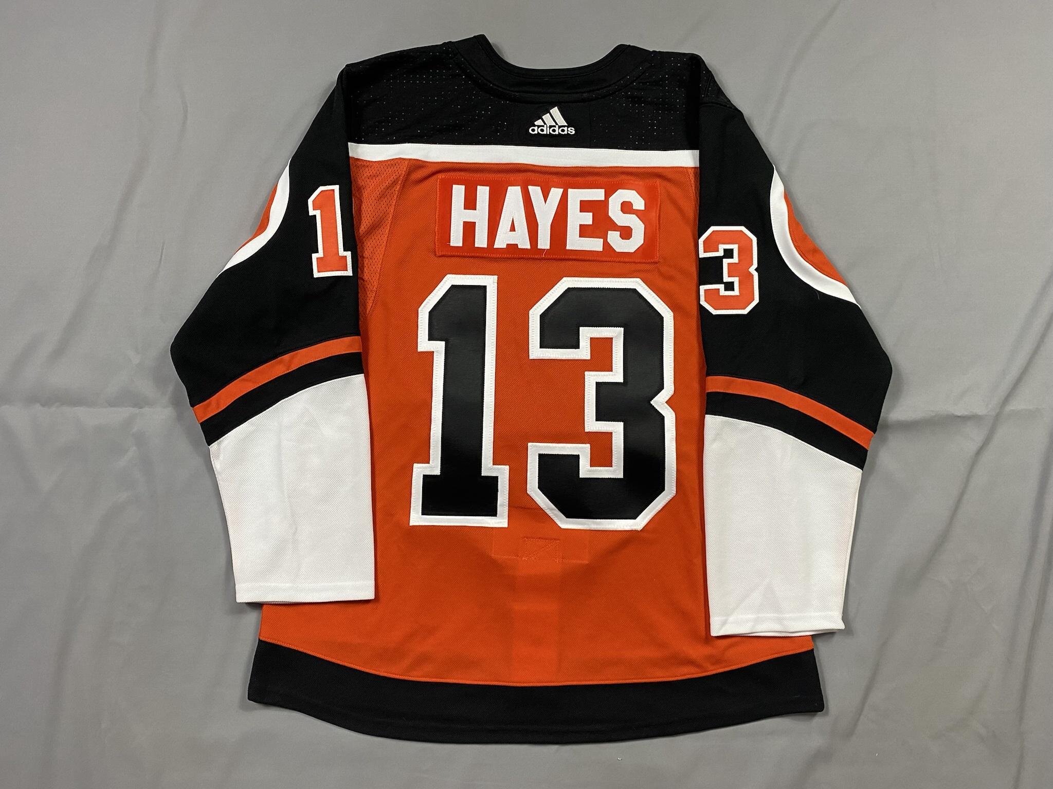
I don’t know why I felt like Hayes was the right choice for this, but I went for it! The customization is so odd on these. The Flyers usually use a twill nameplate for that sharp contrast, but why when it’s the same color as the jersey? The rear numbers are stacked, but the sleeves are reverse kiss-cut? Very strange, but very cool.
Another RR in the books! When I got this jersey, I debated on who to go with. Svech? Teuvo? Aho? Who didn’t I have a jersey of? That’s right, mister floss himself, Doogie (please re-sign ily bby).
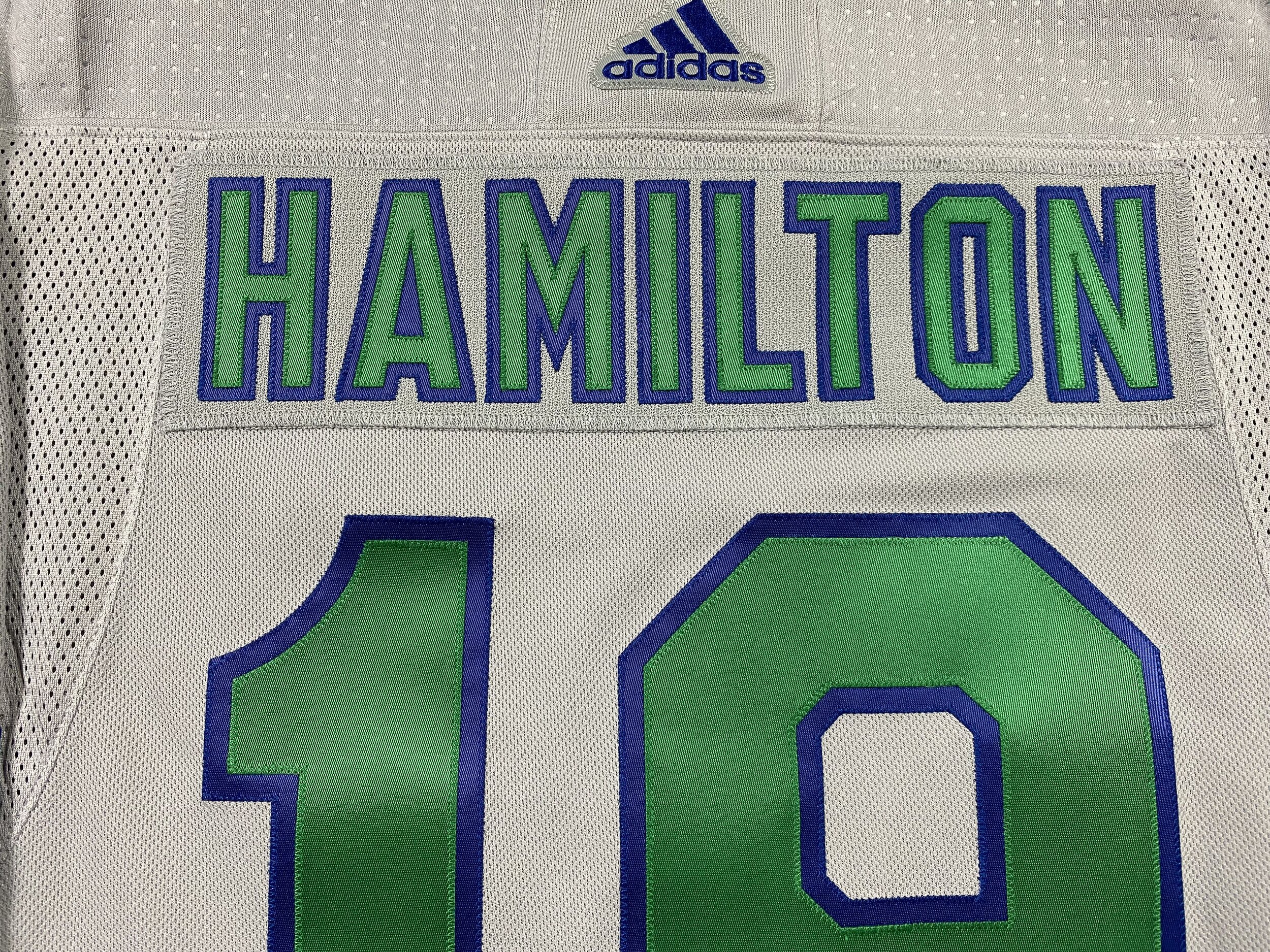
EPS is the only place I’ve seen that can get the nameplate color perfect - CoolHockey and others are usually just slightly off. Gray is underrated on how difficult it is to match, and EPS killed it.
I just wish they used white instead of blue as the outline on the kit so it was a little easier to read from a distance.
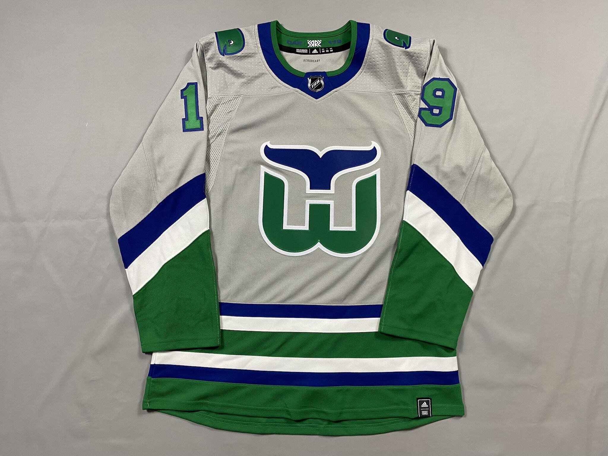
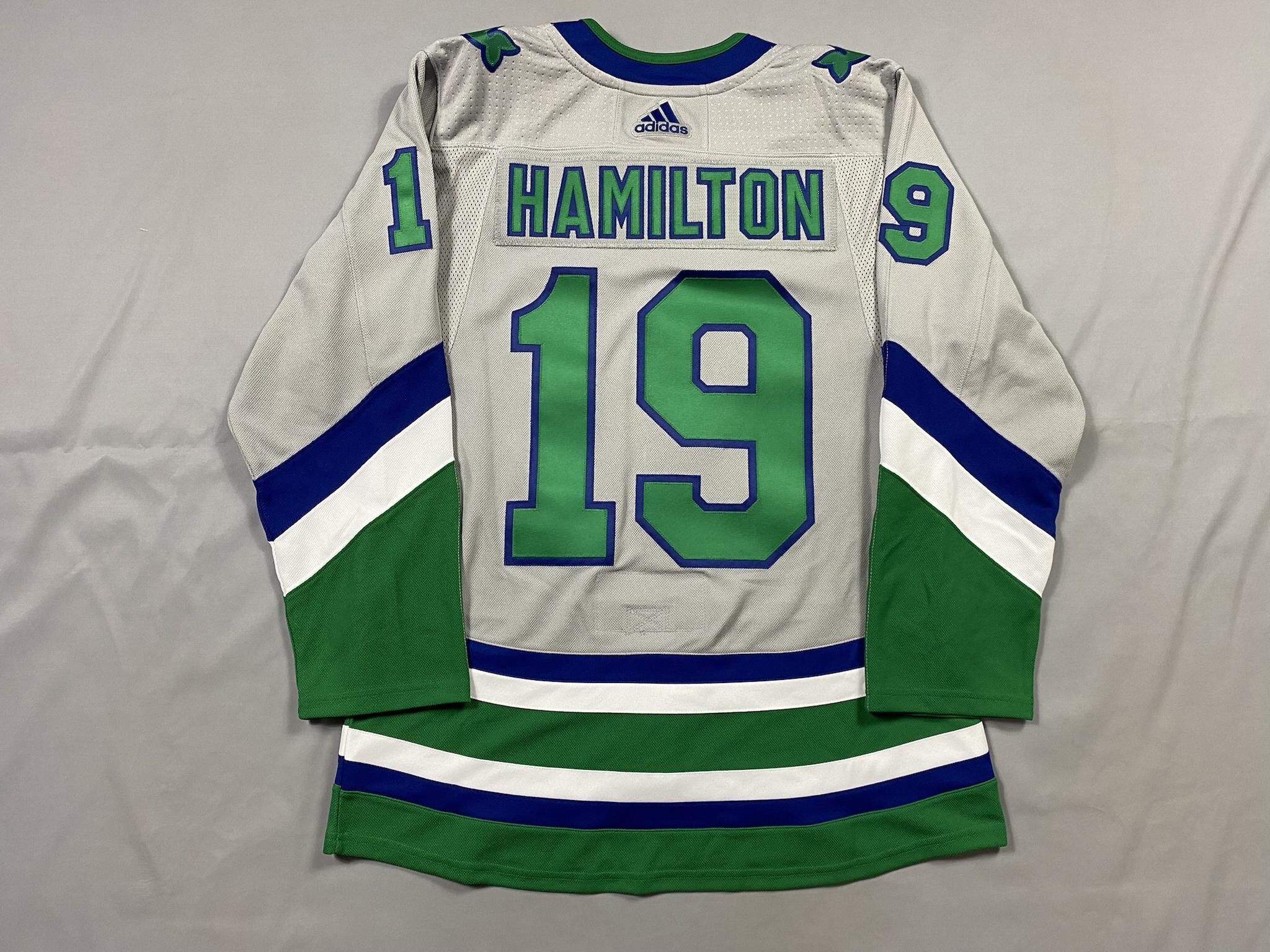
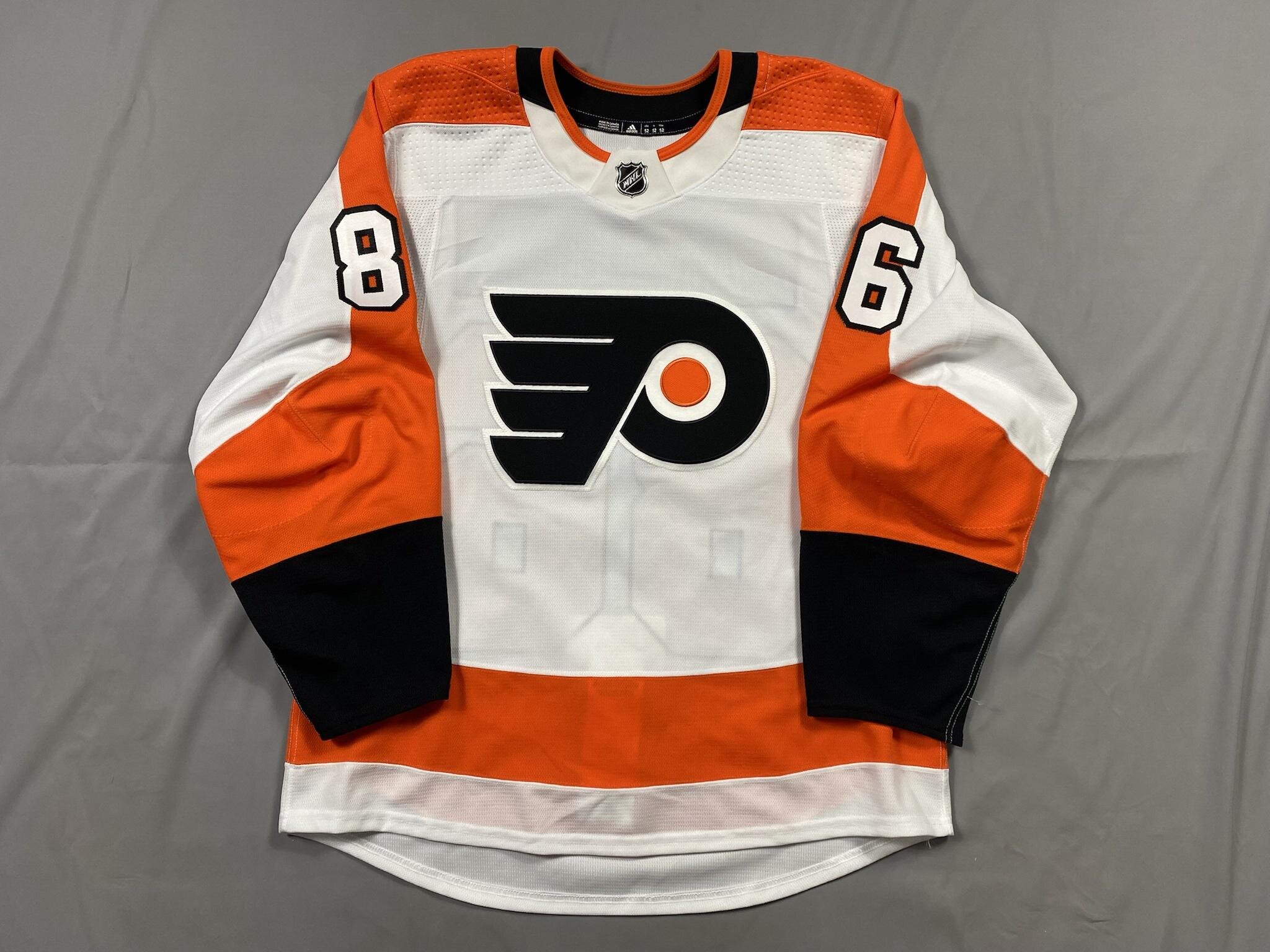
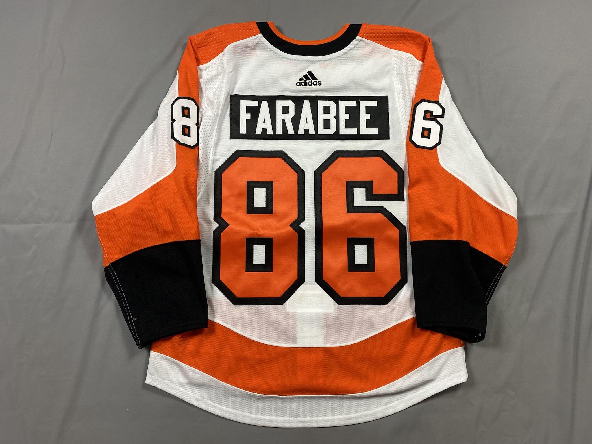
I had a blank white MiC jersey, and I was debating on who to put on it. Farabee changed his number this year to 86 - one of the best numbers in the league (Teuvo) and I had to get it done. PX did a great job on this, as always.
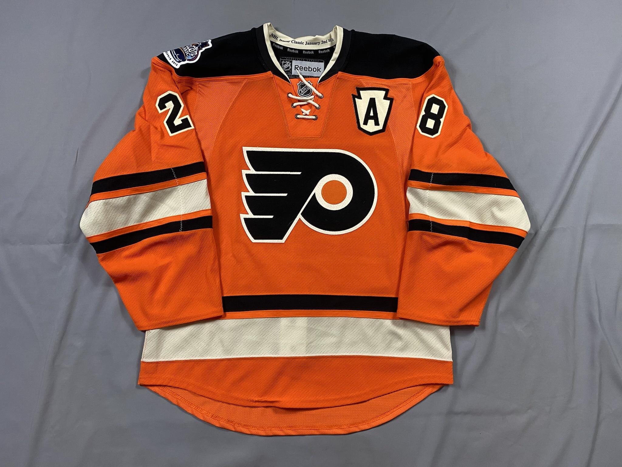
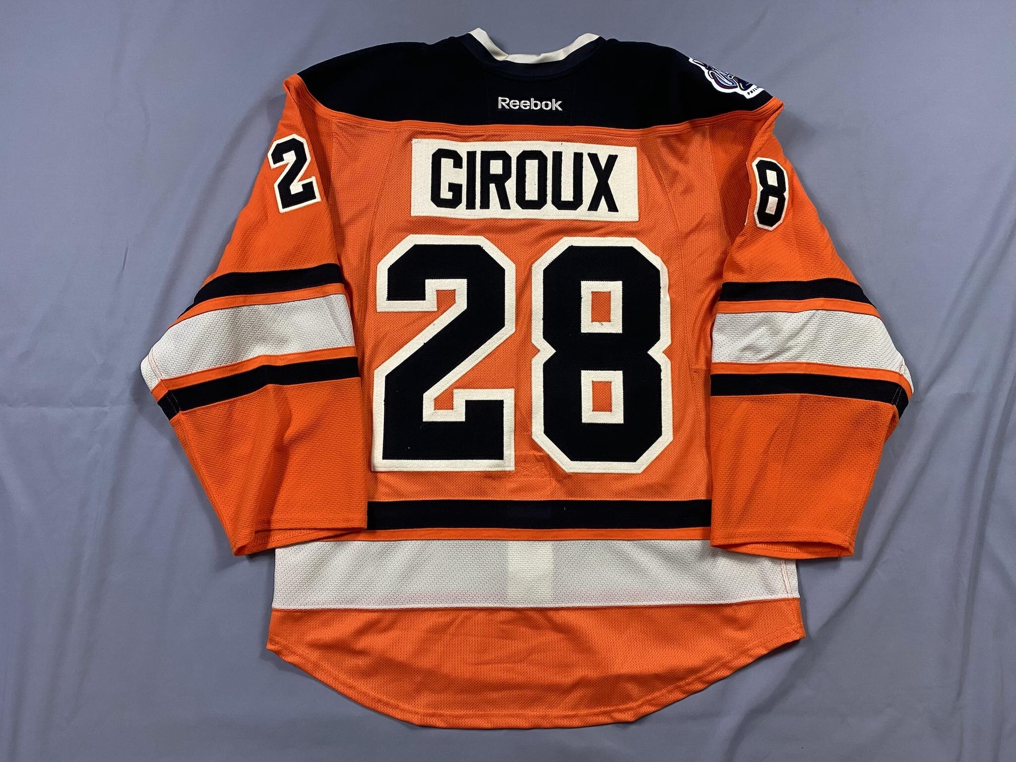
I had this jersey for a while, and discovered that the kit was incorrect. I think I had a jersey that was Reebok Factory when they were still selling true authentics, and it was pretty nasty - including a twill nameplate! Flyers used felt for the entire kit, and the front keystone patch was reverse kiss-cut, not stacked. So, I stripped it and it was a huge pain. I hate stripping felt.
PX made this absolutely gorgeous.
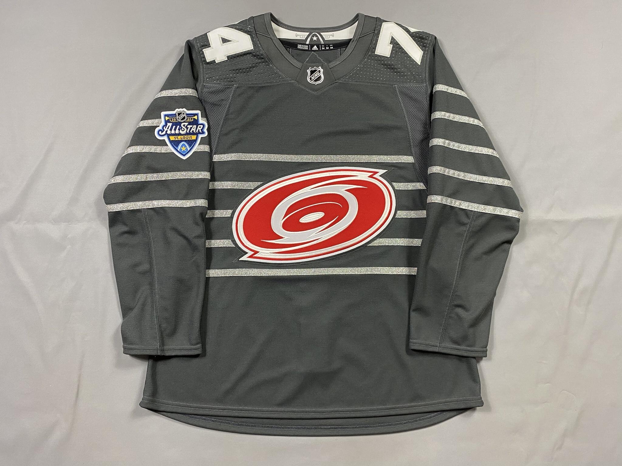
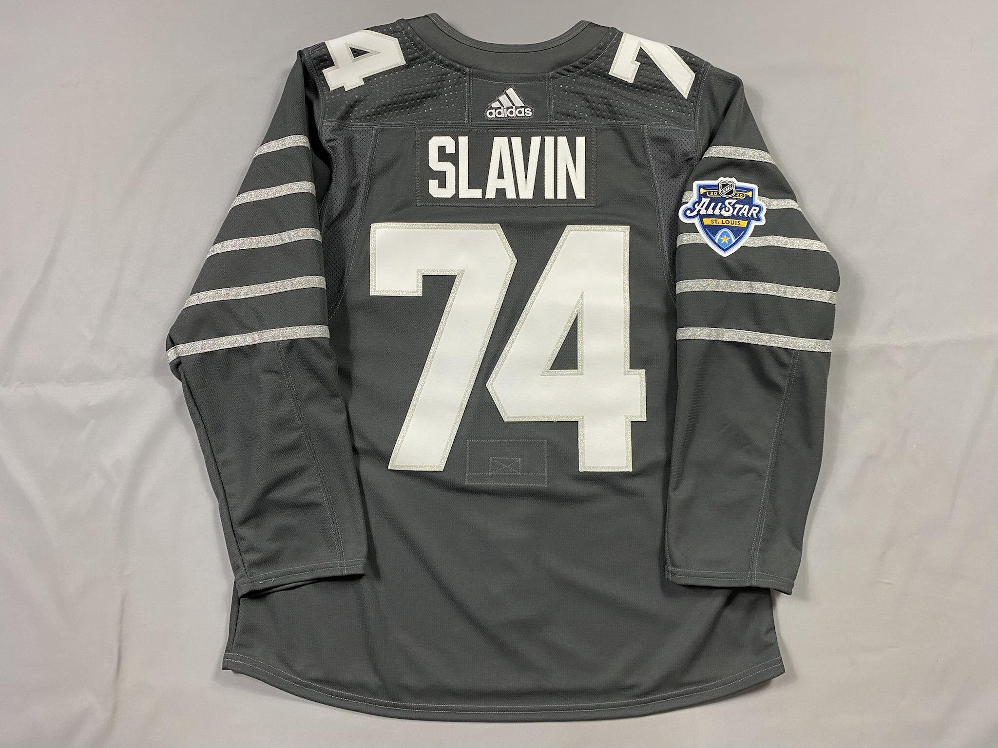
This was a huge project for me. See, in 2019 the NHL decided to have team crests on the front of the All Star jerseys instead of just the NHL shield. This took them from using 2-4 jerseys for the ASG to a whopping 62 jersey designs (two for each team). The problem then becomes they don’t make some or any jerseys for some teams. The Hurricanes got this treatment - Adidas only made white jerseys for retail. I decided that wasn’t good enough.
I picked up a retail MiC Kings jersey and a white Canes Indo, and took the crests off. EPS then added a gray layer and assembled it!
Since the Metro was eliminated before they could wear gray, I don’t believe that any gray Metro jerseys exist, so this is officially a 1/1 jersey, completely unique to me. I love it.

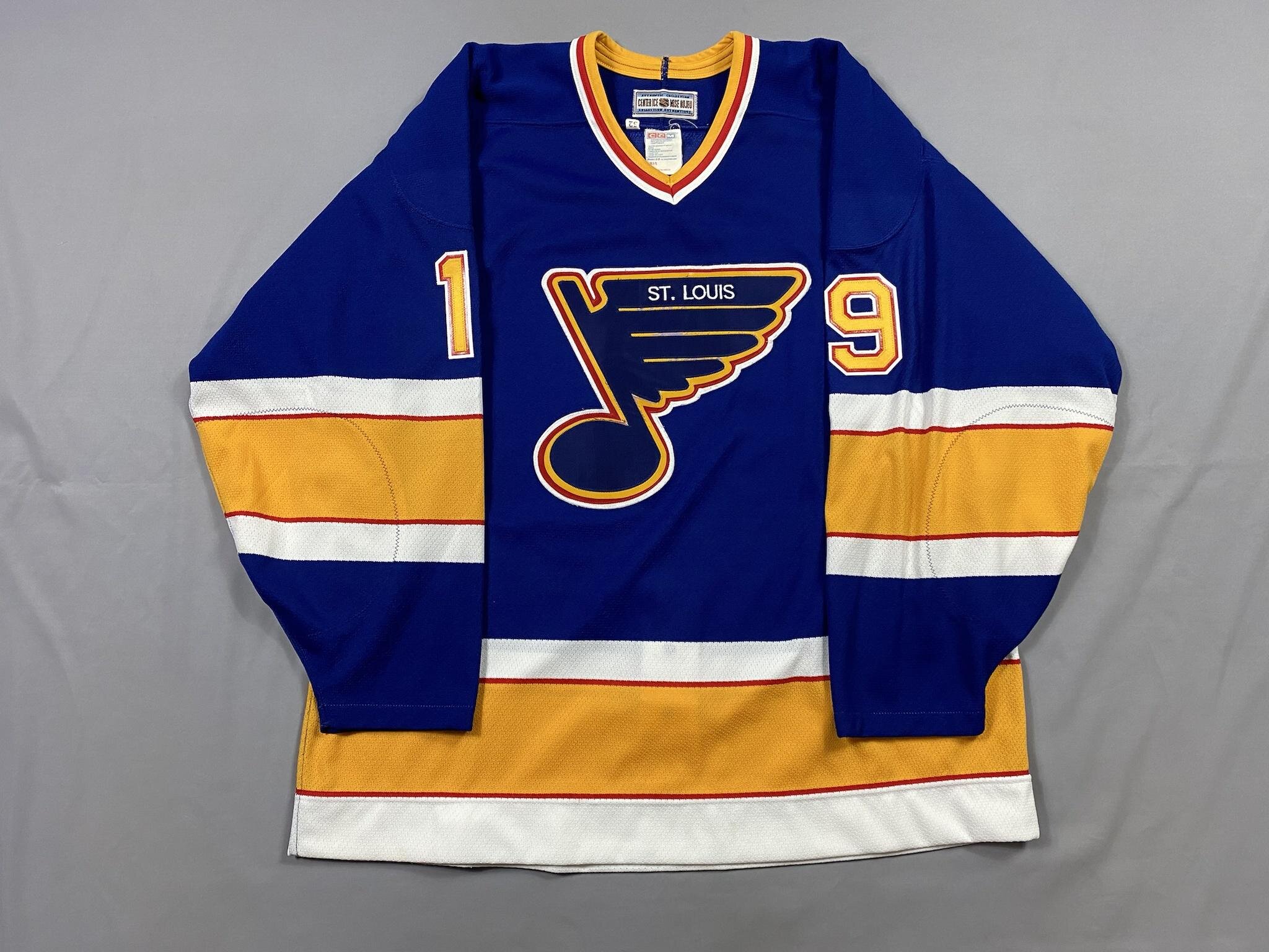
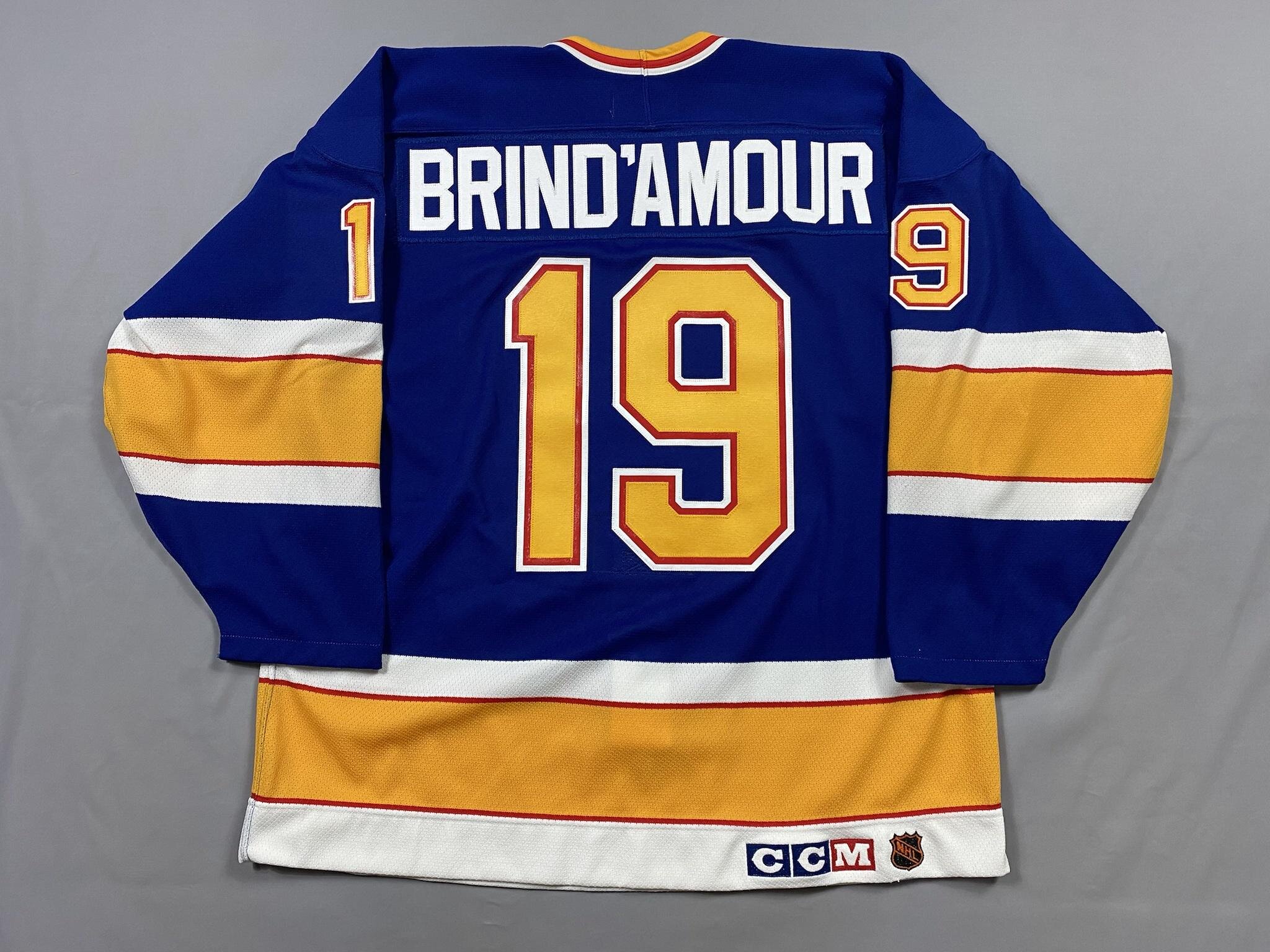
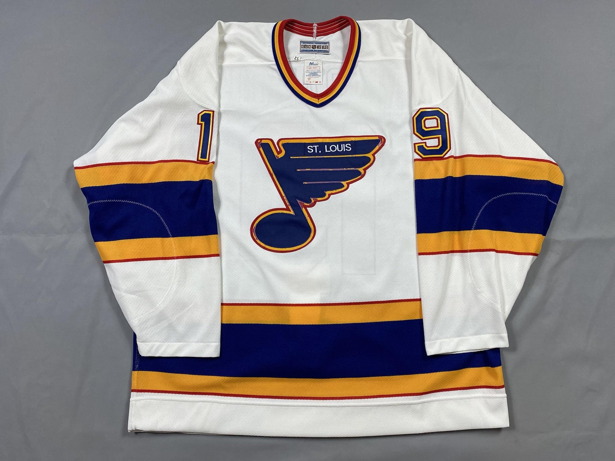
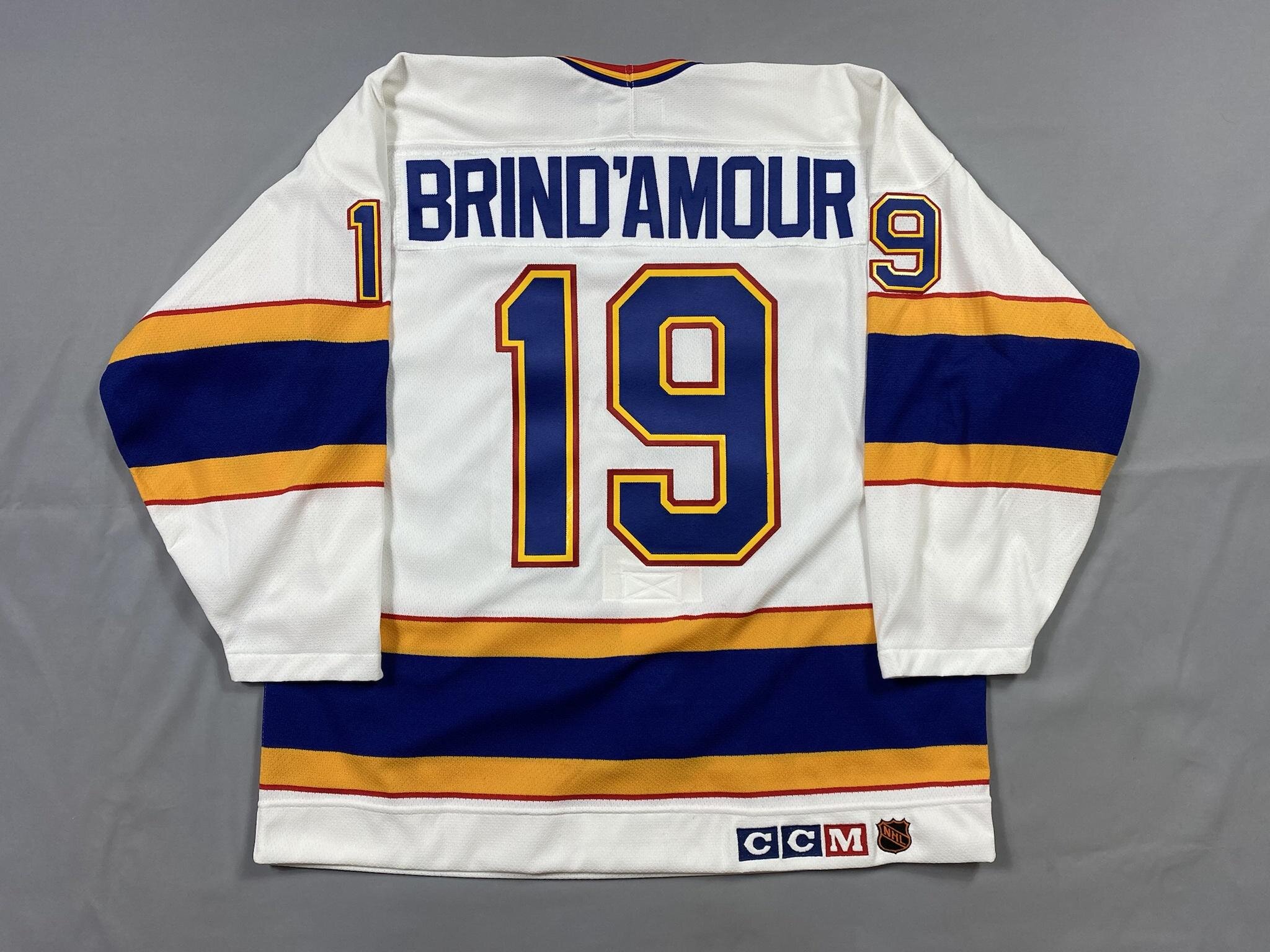
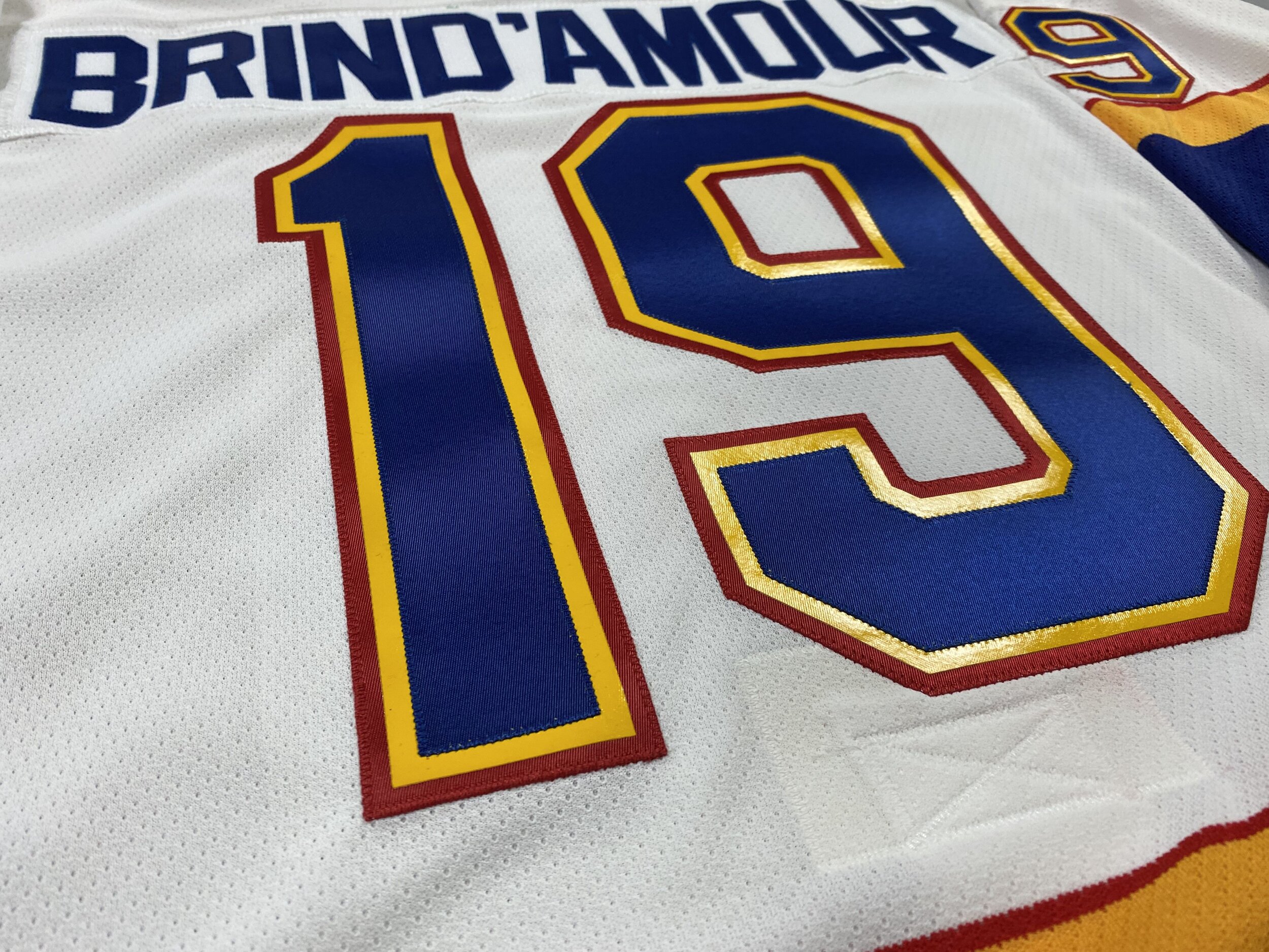
And finally, the stars of the show. If you know me, you know that I have an undying love for Rod Brind’Amour. He represents everything you want in a hard-nosed player and coach, and there’s a reason players would absolutely run through a wall for him. I had many talks about old jerseys with VanCanFan75 of the Hockey Jersey Addicts podcast about the glories of old CCM Big Block jerseys, and he sent me on a quest to not let my dreams be dreams.
I first had to obtain the jerseys. The Blue was relatively easy - about a month into my search a blank popped up for a pretty reasonable price, easy enough. The white was another story. I initially thought I’d be a 48 in old CCM stuff. So I obtained one of the most disgusting jerseys I’ve ever had the misfortune to come across. This thing was so dirty and actually crusty, and the red on the kit was embroidery, not twill. I scrubbed and cleaned it…to discover that it was too short on me. So my quest started over to find a 52. Someone had up an old one with a very janky Hull kit, with an unverified signature on the jersey. That had to go.
Here’s the thing about these old Blues jerseys. For some reason, they thought it would be just a grand idea to use vinyl instead of twill for the yellow layer. Why? I don’t know. It’s not that much lighter than twill and it cracks if you look at it wrong. I debated on replacing the crests to clean up the yellow cracks, but ultimately decided to preserve the original instead. The other difficult part about these is to find a customizer willing to use vinyl on the middle layer. Well, EPS as usual came in clutch. They had no problem with the vinyl and knew exactly what to do.
Don’t let your dreams be dreams, kids. Chase that grail. It’s worth it.