
A rebrand.
I’ve though about this for quite some time, and I’ve decided that it’s come time to “rebrand” - find something easier to remember, easier to spell, and overall just less cringe. Jerseys don’t need to be dejocked anymore, adidas no longer need their buttons removed, and I’m in the camp of “don’t touch” about the RR tags. So “dejocking” isn’t really relevant to what I do or who I am. It’s a mouthful, and people look at me like I’m crazy when I say what it is.
Hence, it’s rebrand time.
An old name for a new era

Starting in the 1950’s after my grandfather came home from the Korean War, he started a small electrical business in Philadelphia called Liberty Bell Electric. The name has lived on through him, through my father, and now hopefully through me.
My grandfather drew the logo by hand, and put it on everything. The bolt and the bell is such an amazing design - it’s instantly classic, and you know where it’s from and what they do. I’d be silly to not use it.
An updated logo

Not much needed to be changed with my grandfather’s logo - it’s pretty great. I wanted to bring just a touch of my own flair to it.
I sharpened up the bolt, and added a splash of color, as well as a little secret to reflect that I’m not quite in Philly anymore.
What’s in a name?
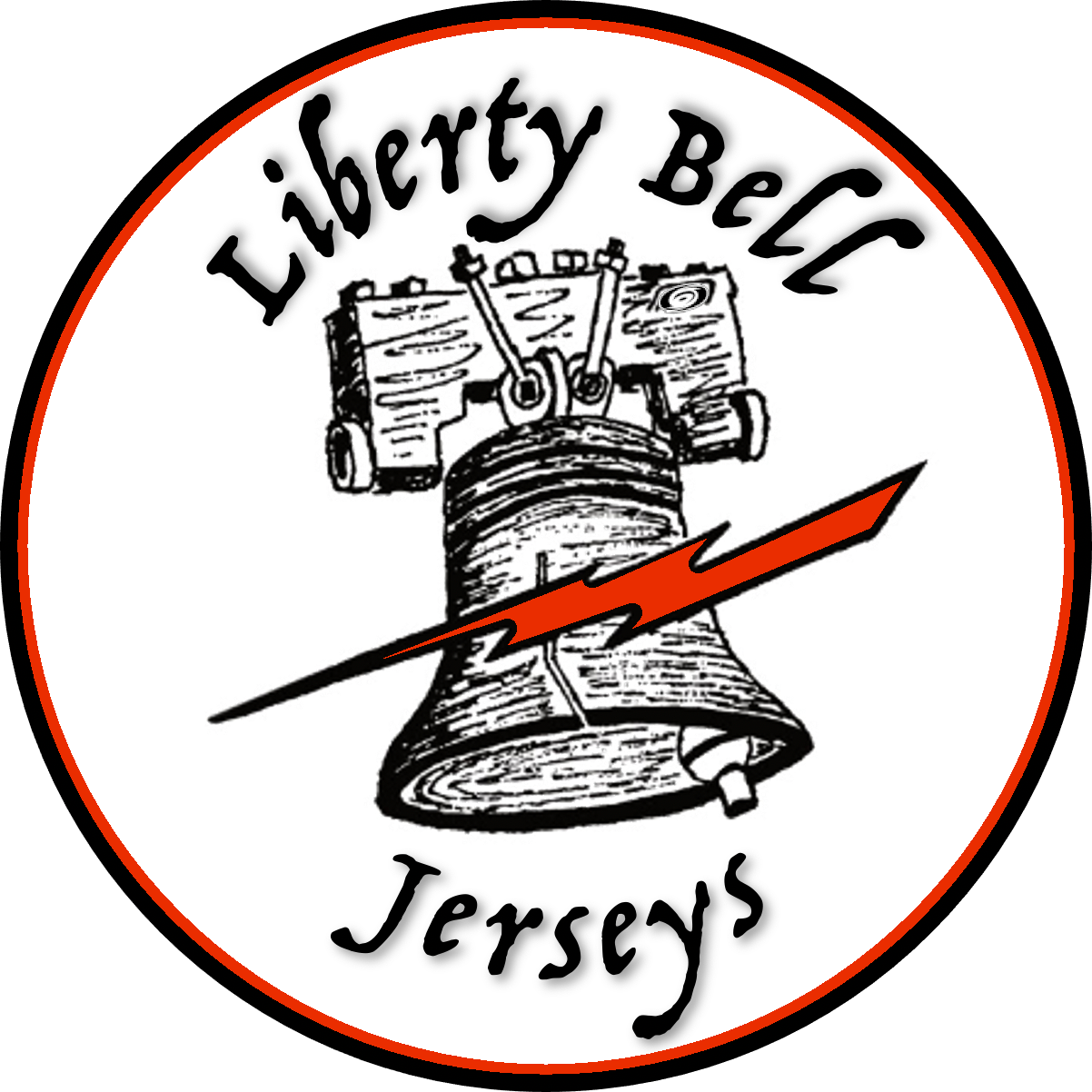
I wanted to keep the “Liberty Bell” part of the original name, however the “Electric” part wasn’t relevant. Changing it to “Liberty Bell Jerseys” was an easy choice - clear and to the point of what I do.
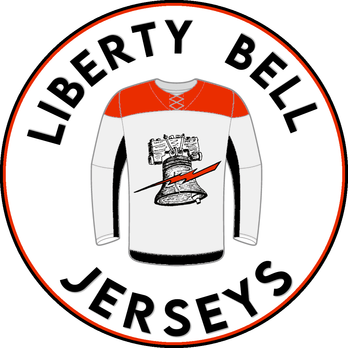
But what about the logo?
The logo on its own is great and it has its own personal story to me. I experimented with including a jersey in the design, but ended up scrapping that idea. The font was actually a tougher choice!
I’d love to drop the roundel in the future, as I do think it’s not the best possible design.
Enter TJF and STBVisuals.
I bounced my ideas off of a few people - VanCanFan75 of the HJA Podcast, @InstantKate, and @TheJerseyFinder - and we made some great progress. TJF eventually suggested that I reach out to Tyler of @STBVisuals for a non-roundel logo idea. A better design is coming, I promise!